


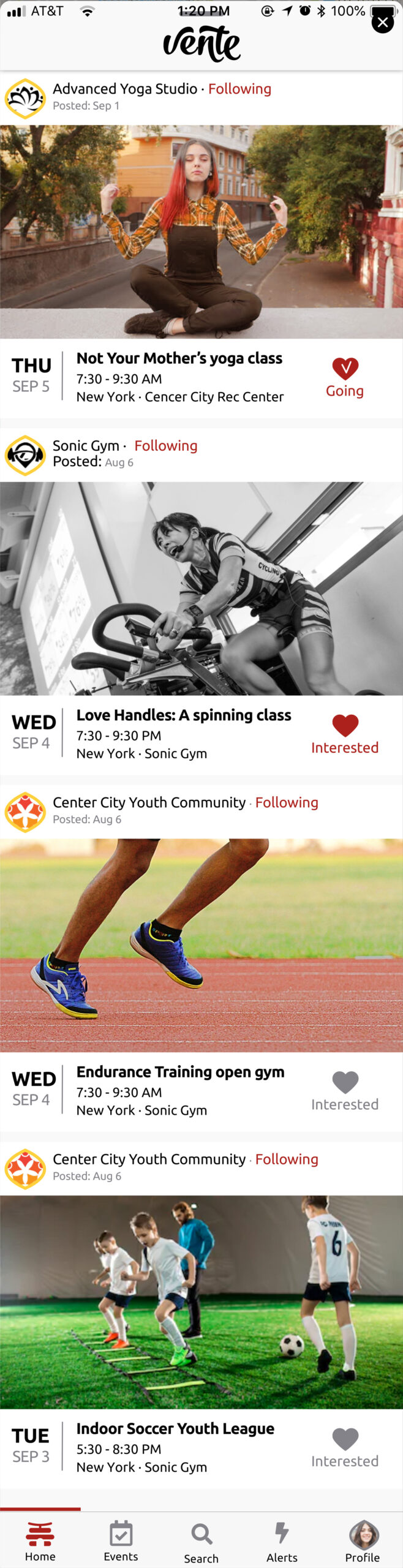
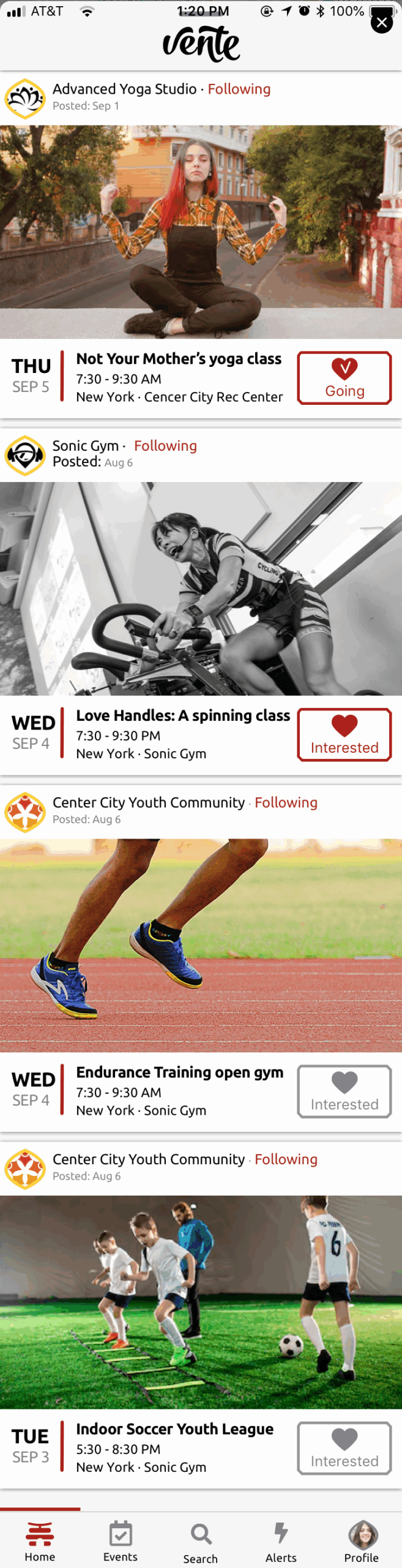
 BEFORE
 AFTER
AFTER


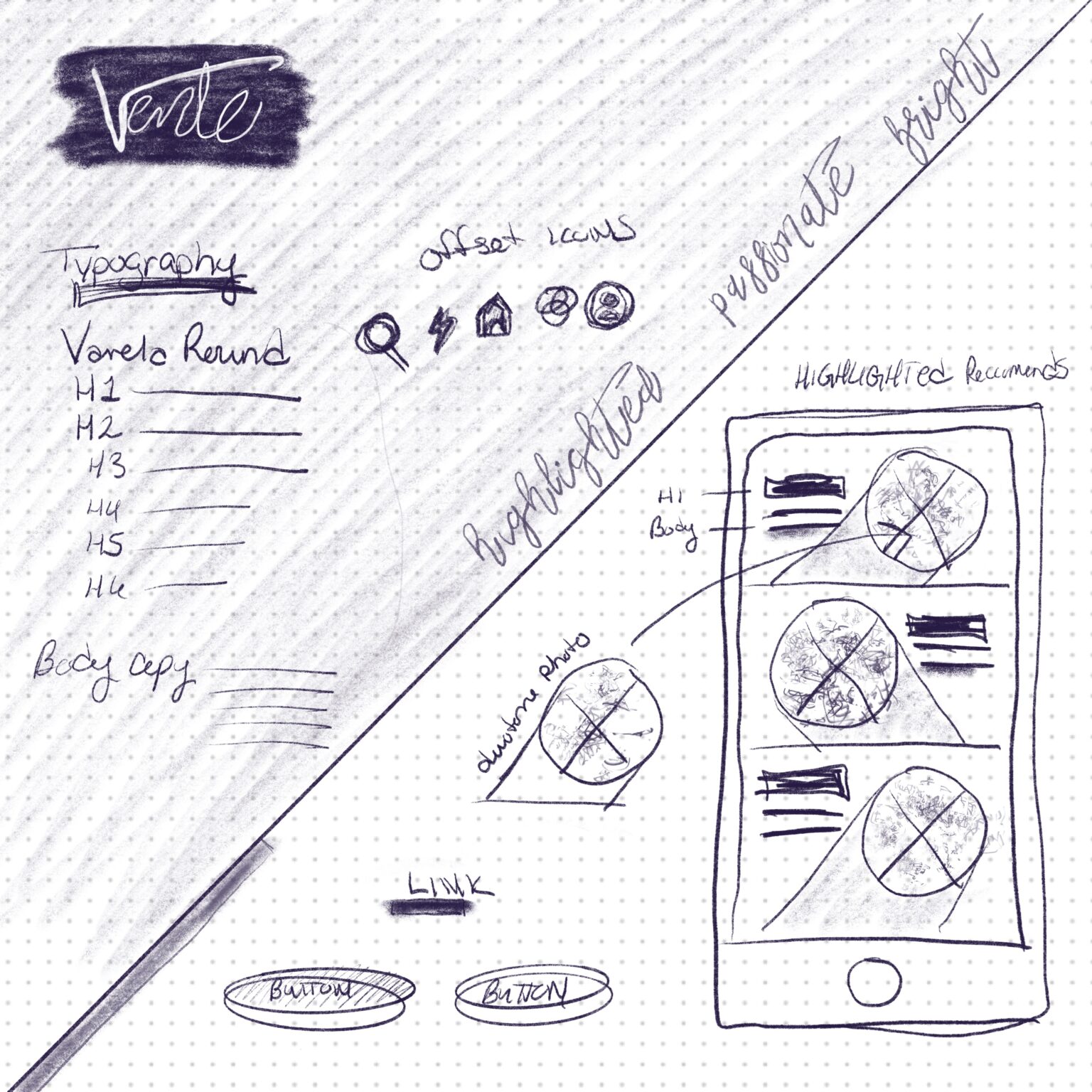
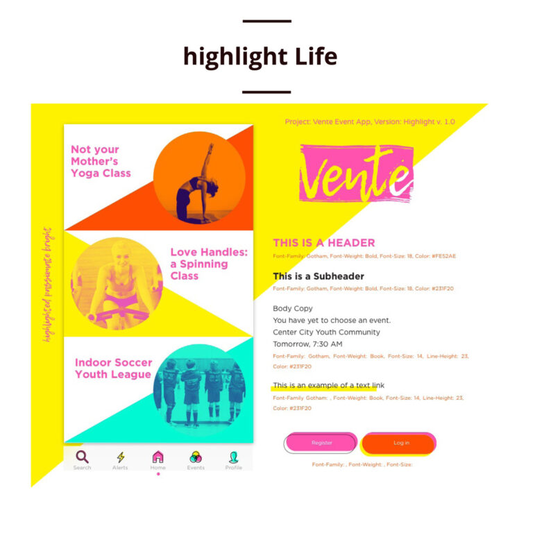
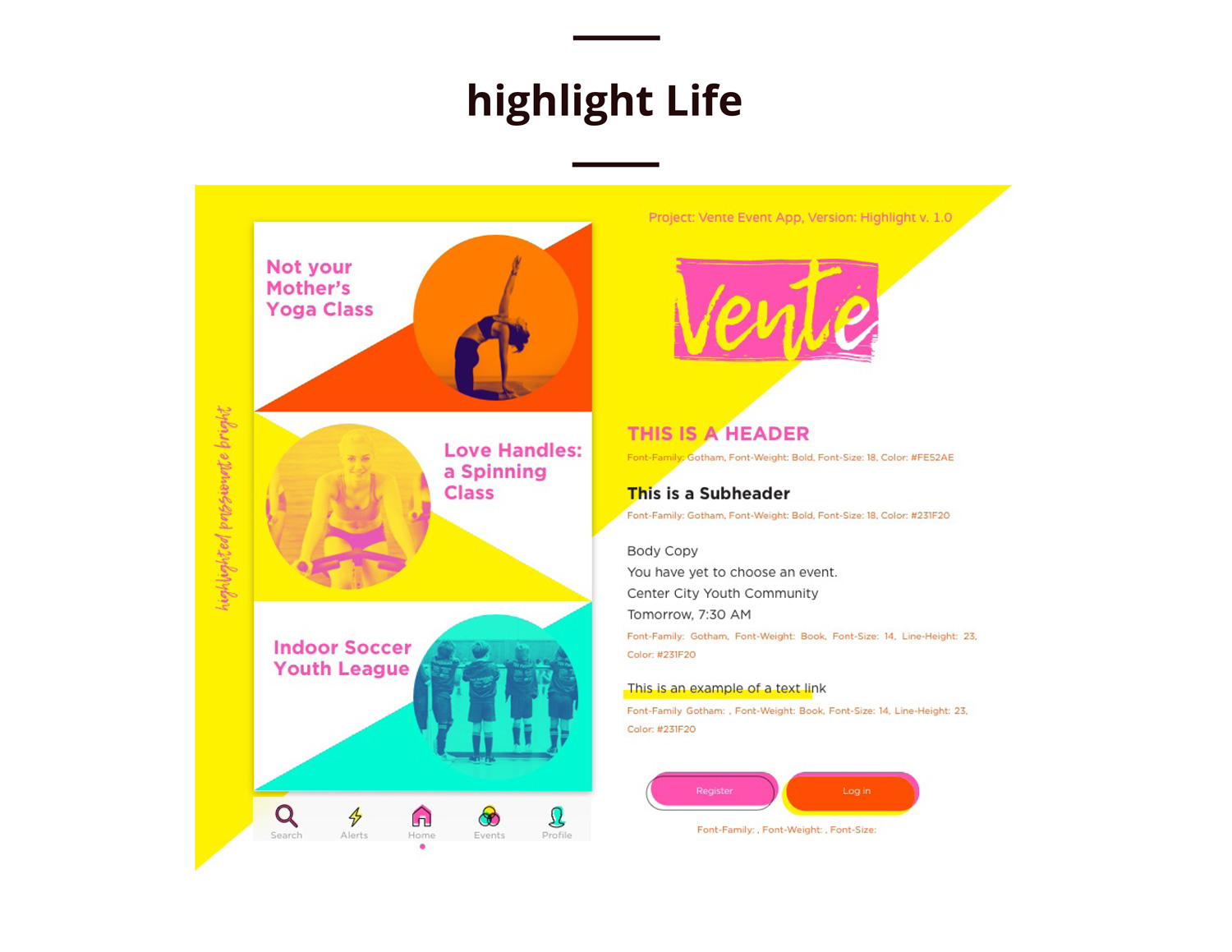
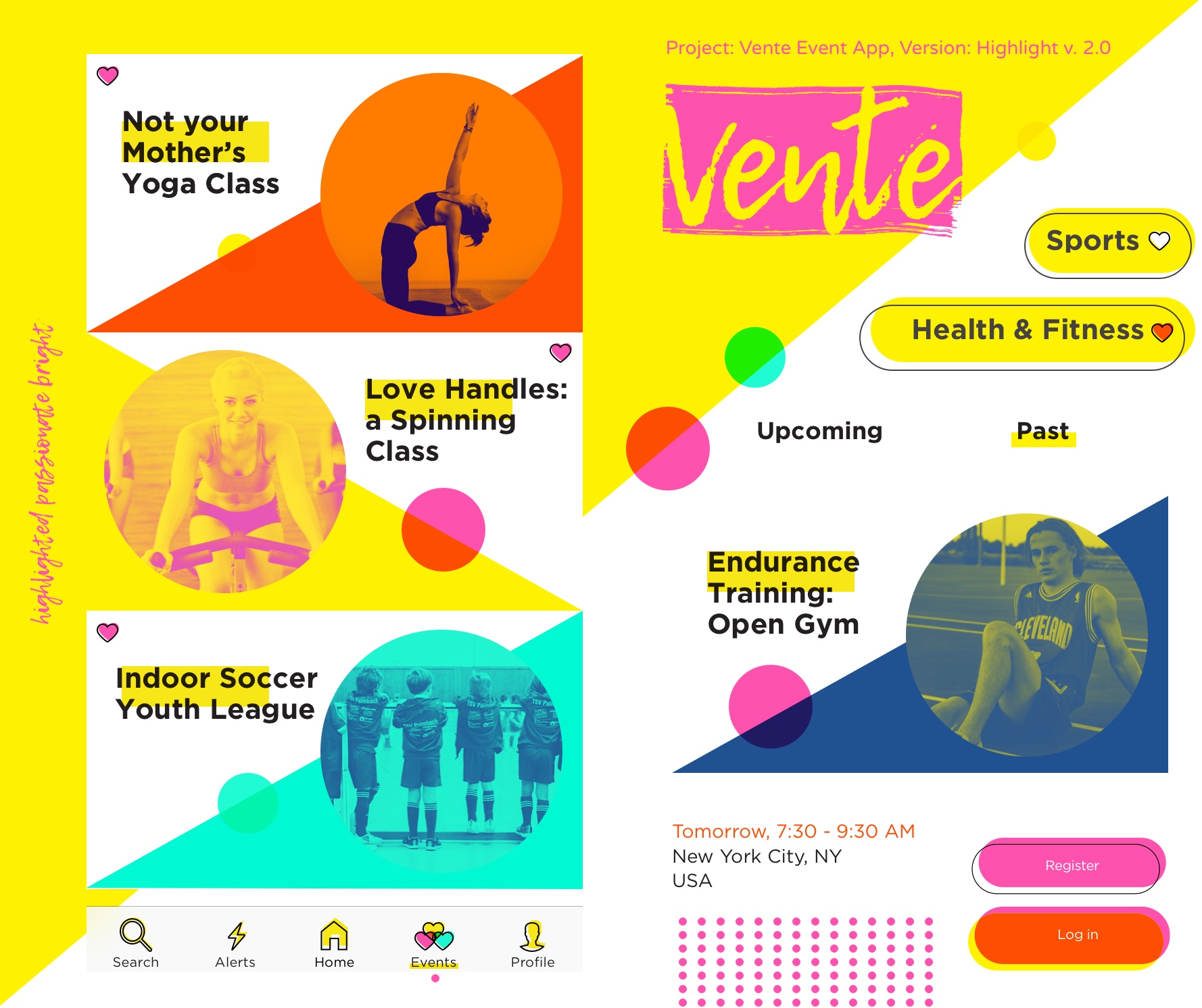
Highlight Life
 BEFORE
 AFTER
AFTER
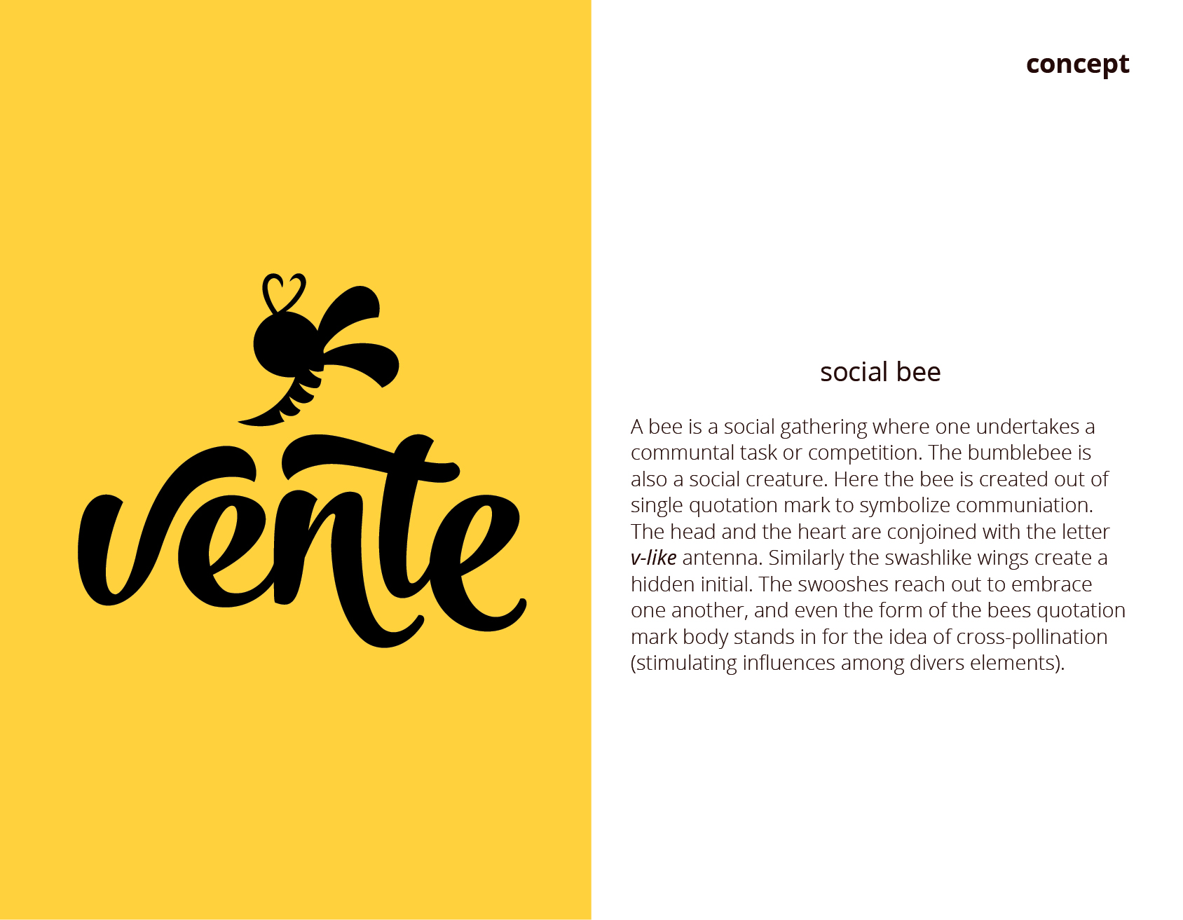
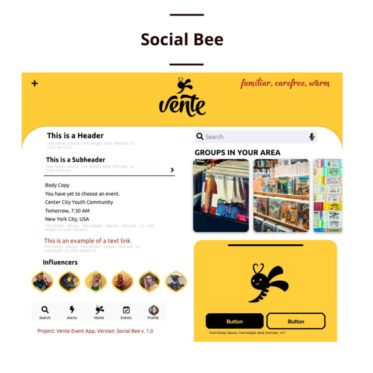
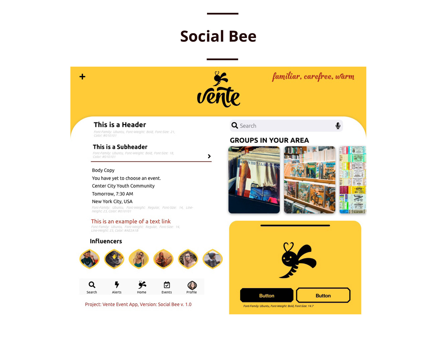
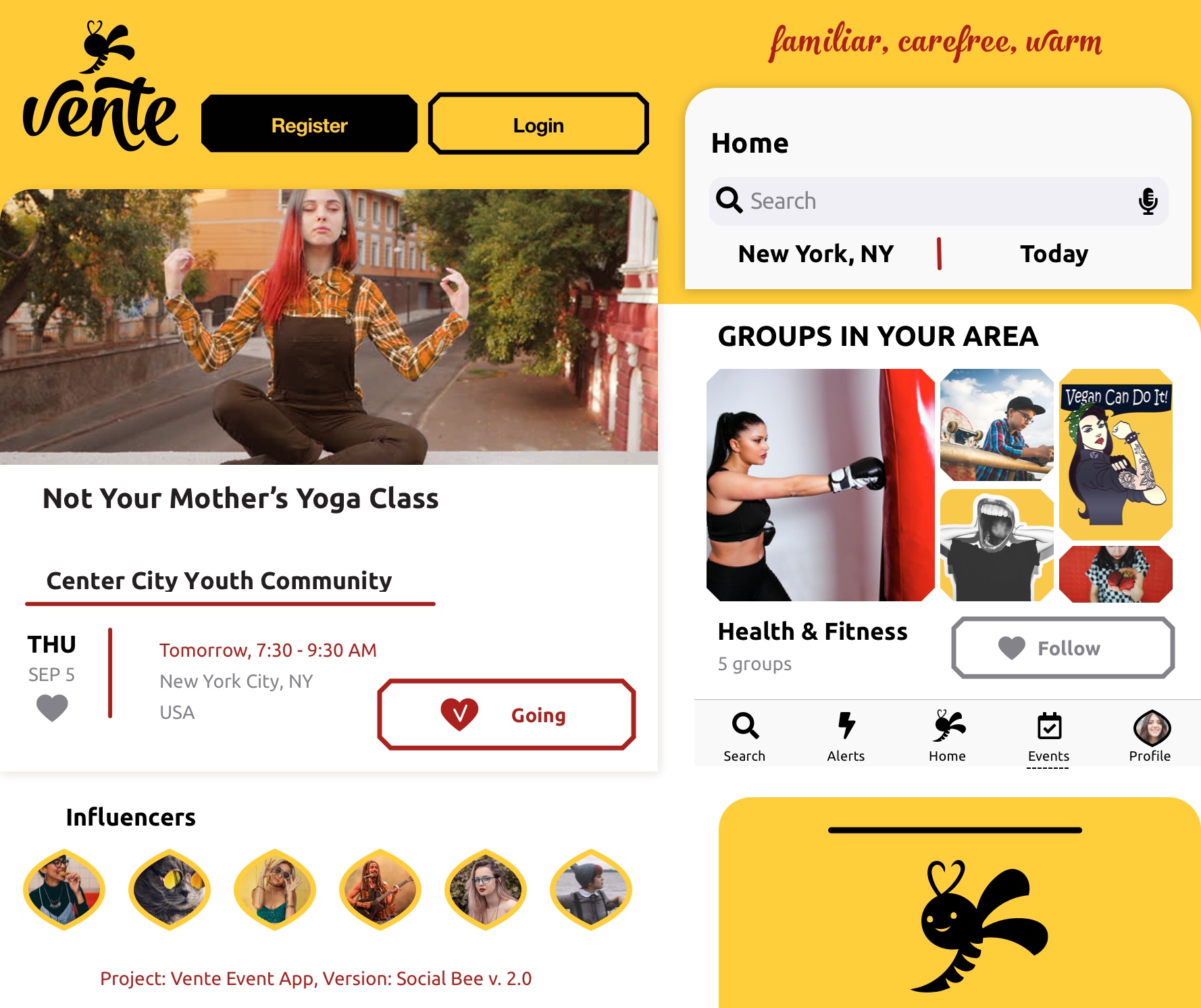
Social Bee
 BEFORE
 AFTER
AFTER
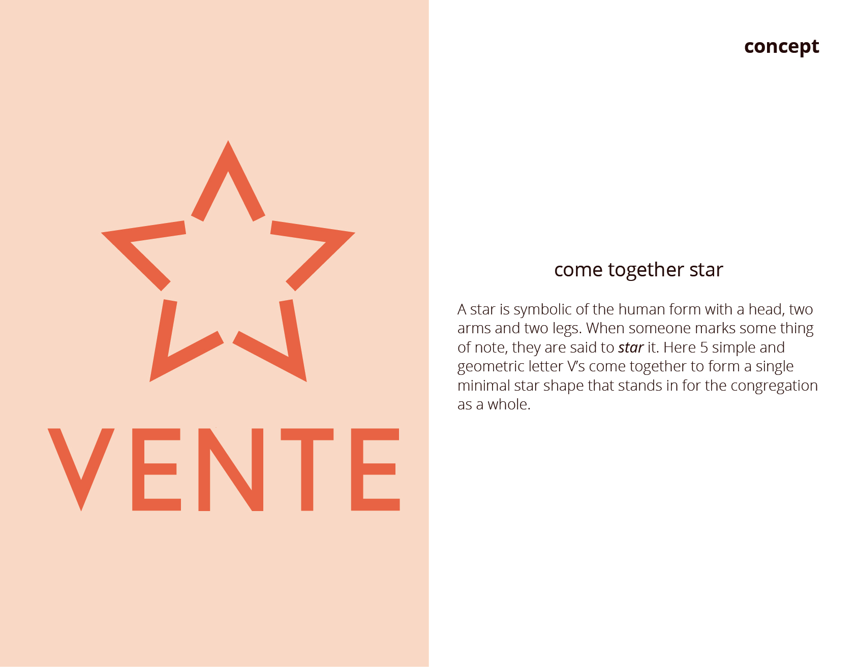
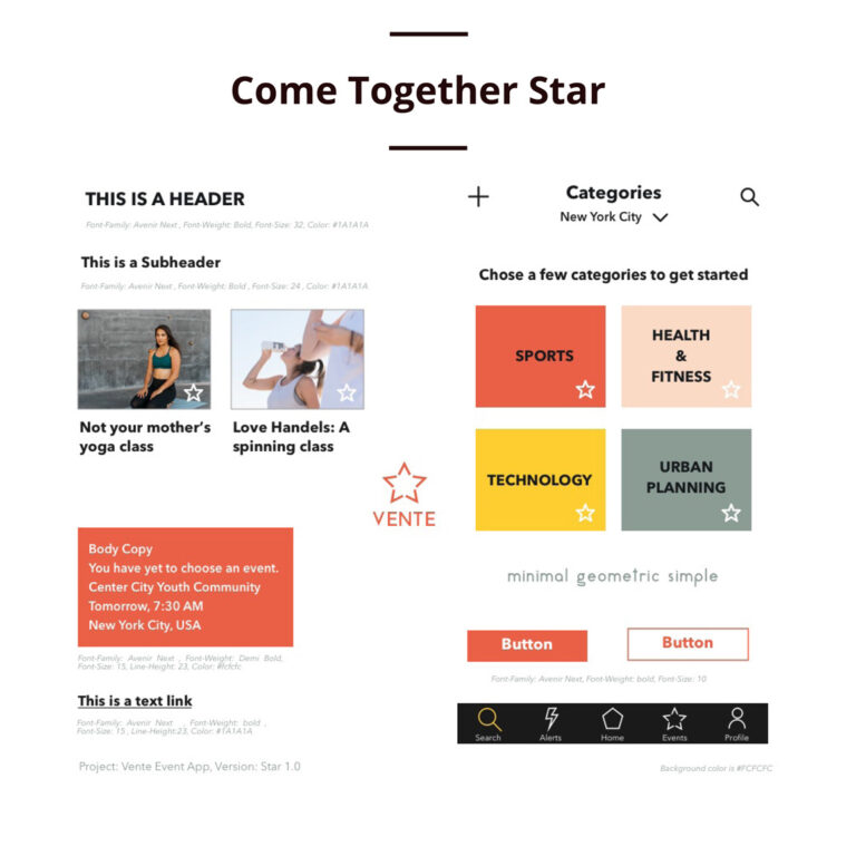
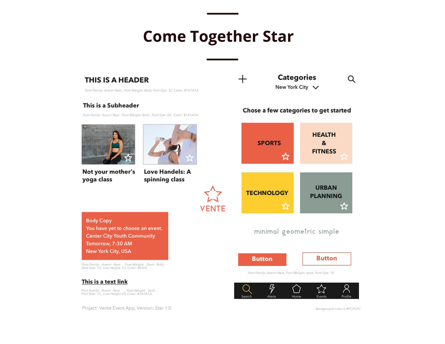
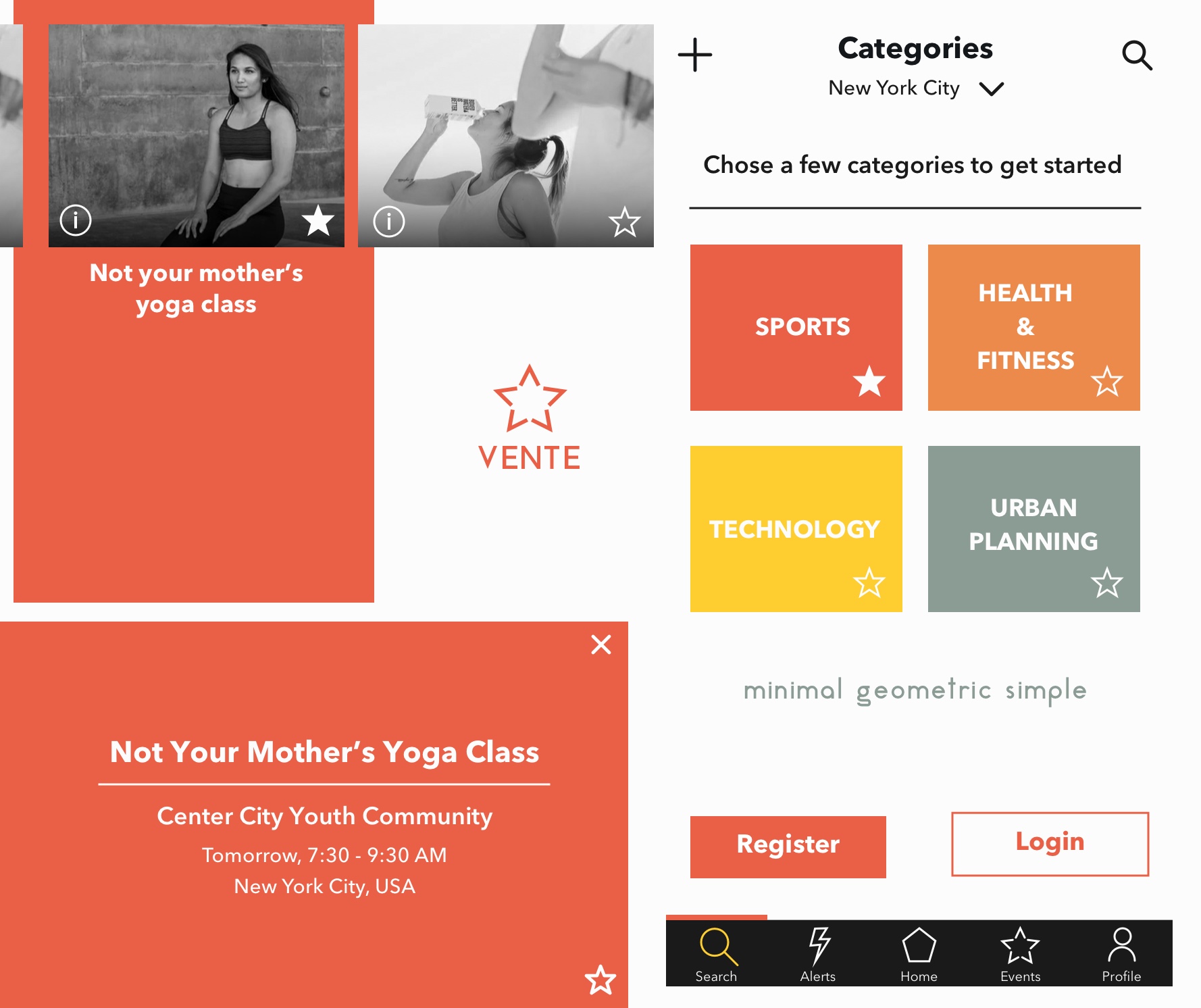
Come Together Star
 BEFORE
 AFTER
AFTER
Highlight Life
 BEFORE
 AFTER
AFTER
Social Bee
 BEFORE
 AFTER
AFTER
Come Together Star
 BEFORE
 AFTER
AFTER


 Draft
Draft
 Final
Final


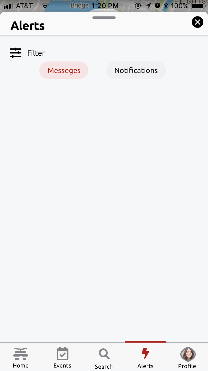
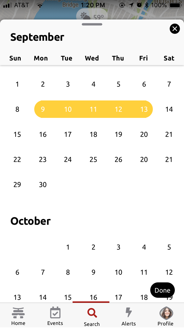
Responsive Design
Seamless experience across all devices
Desktop
Tablet

Mobile