


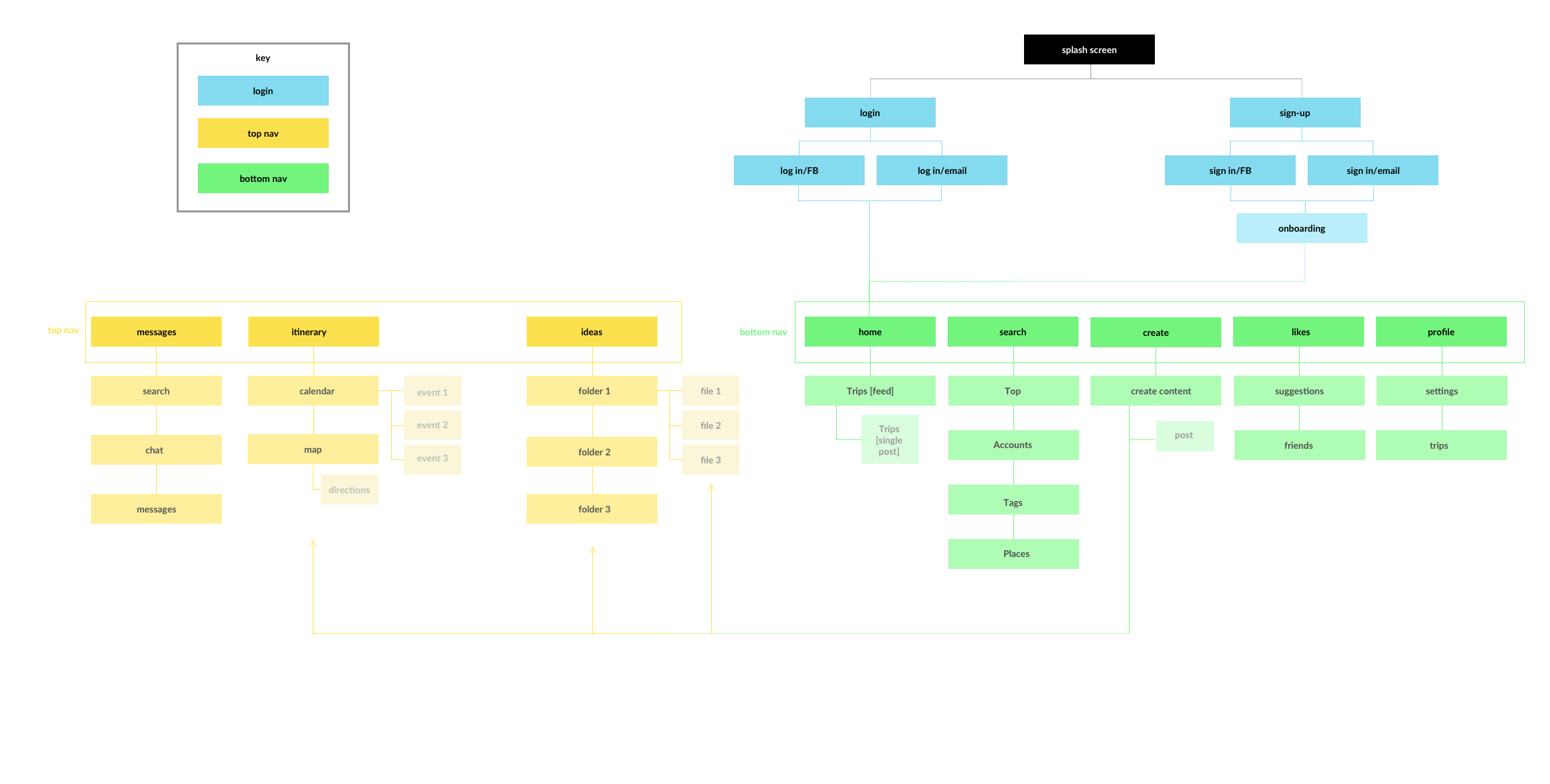
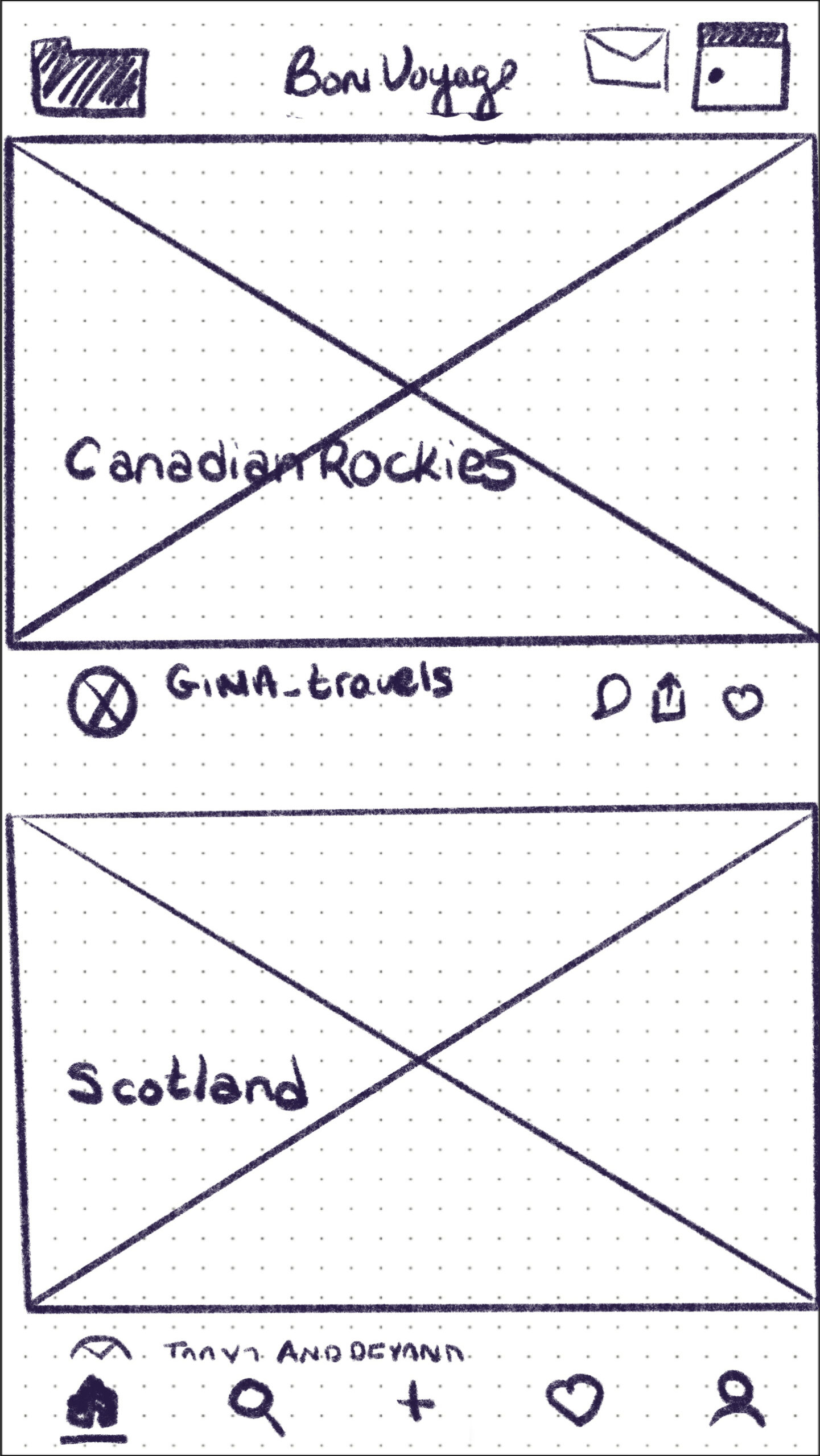
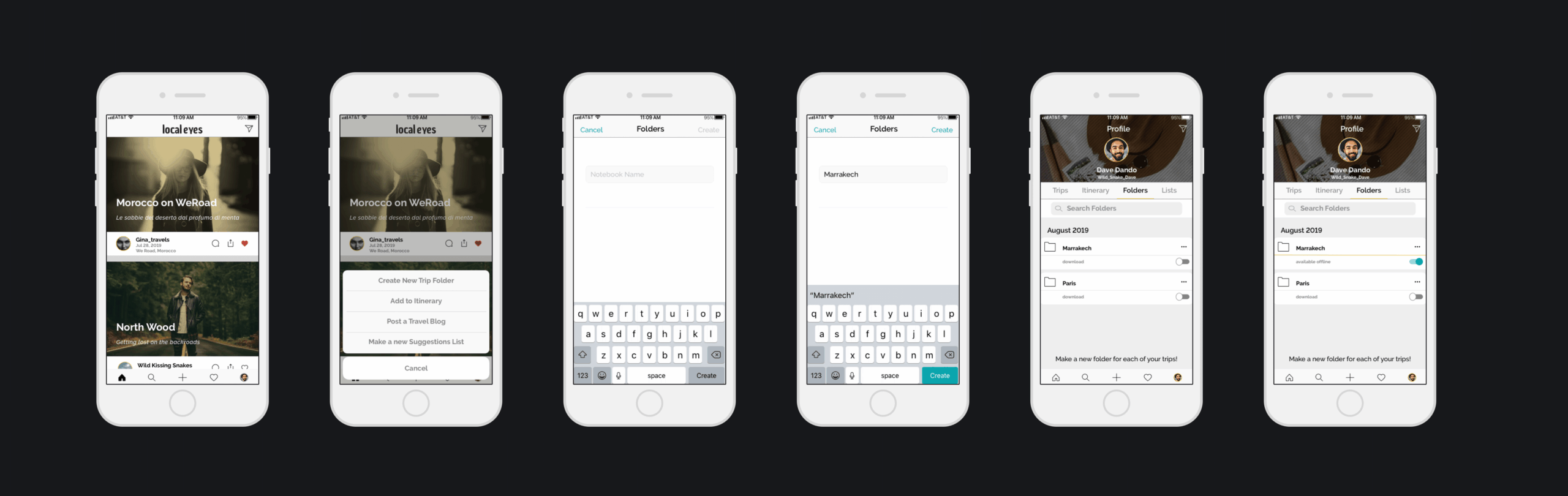
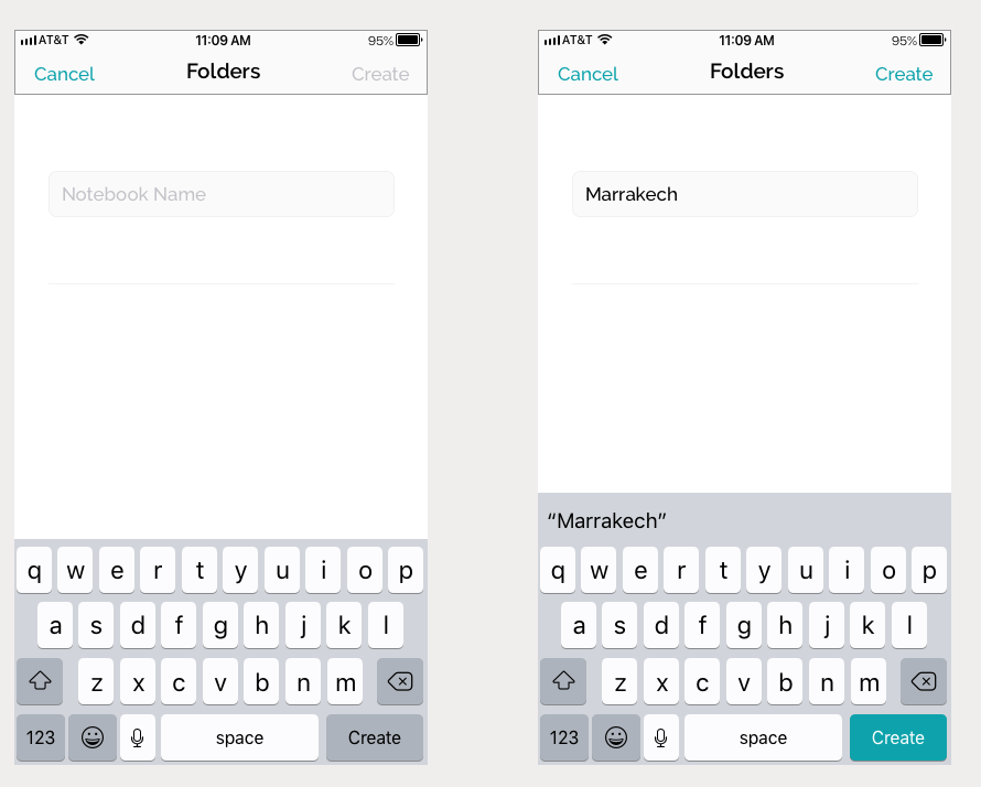
User Task: Create and save a new trip folder to organize travel content based on personal interests.
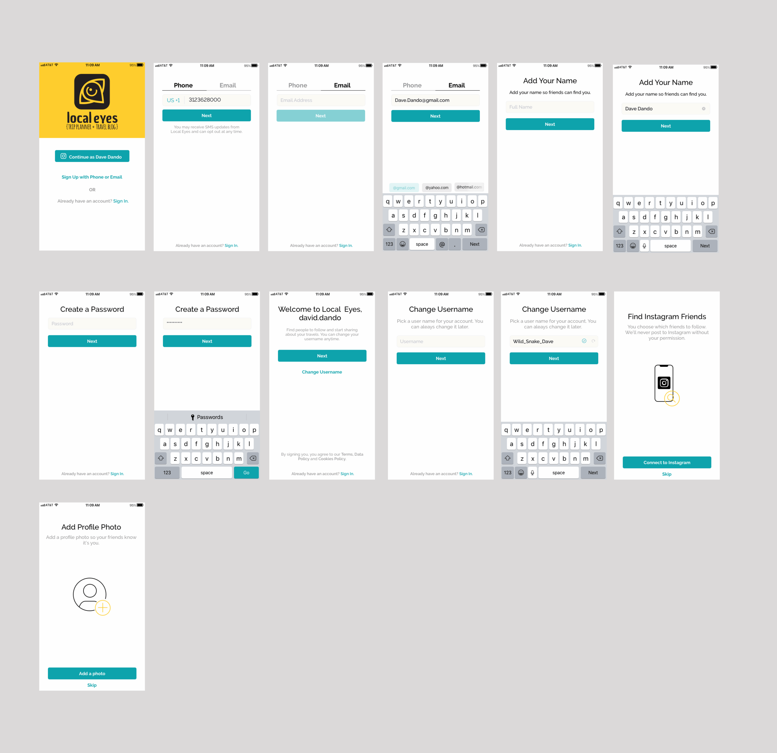
Open app

Step 01
Open app
Step 03
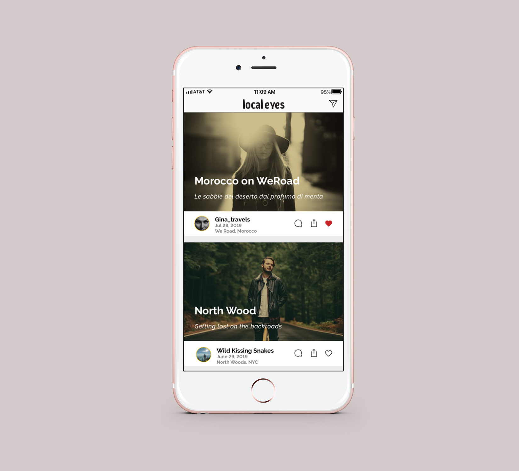
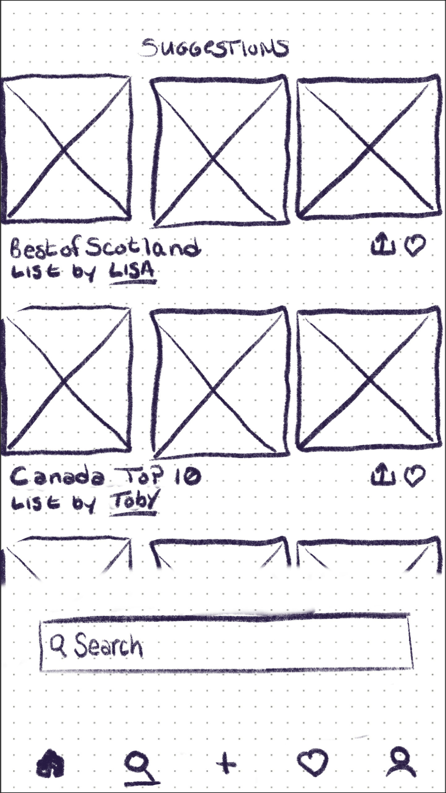
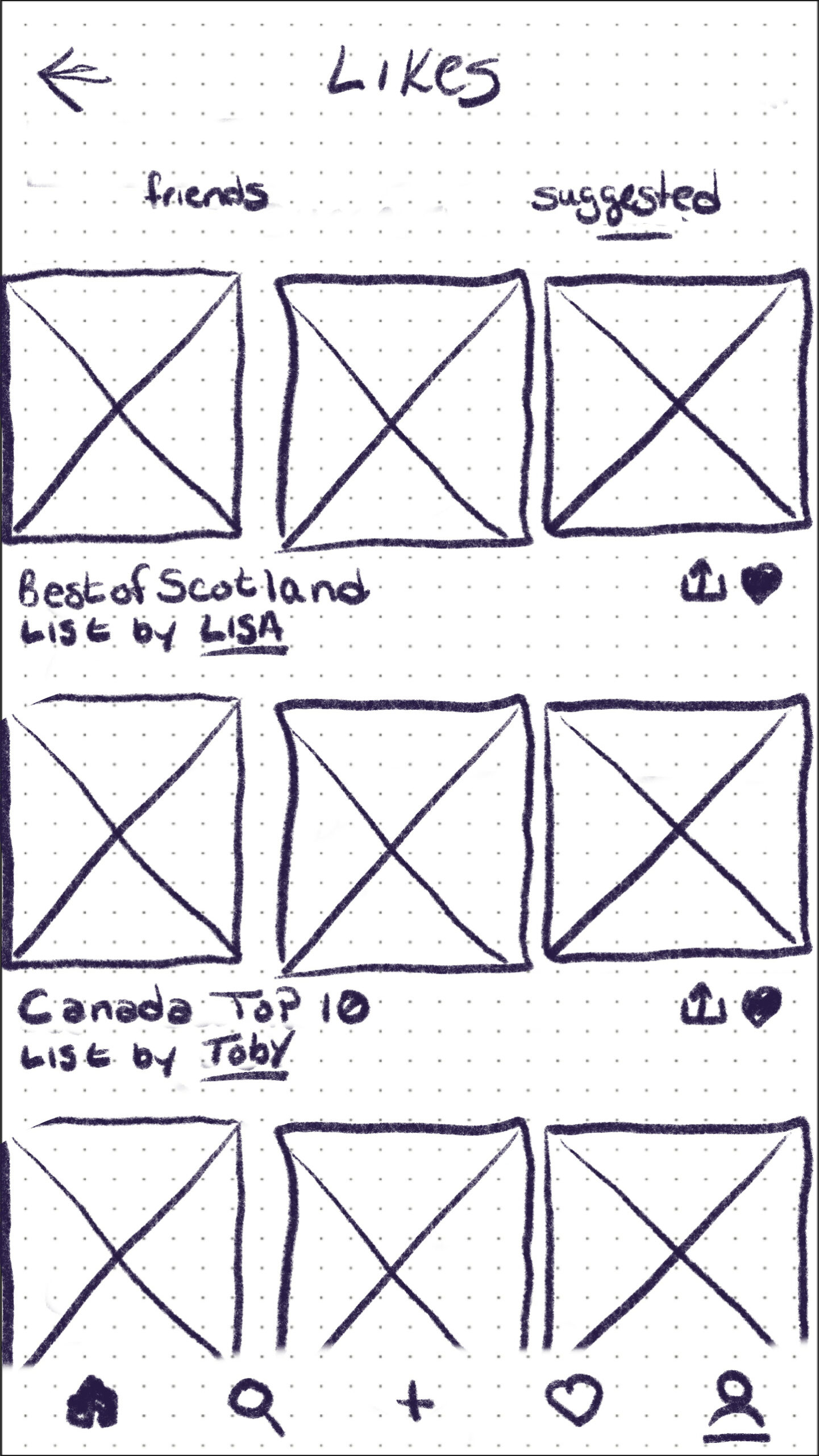
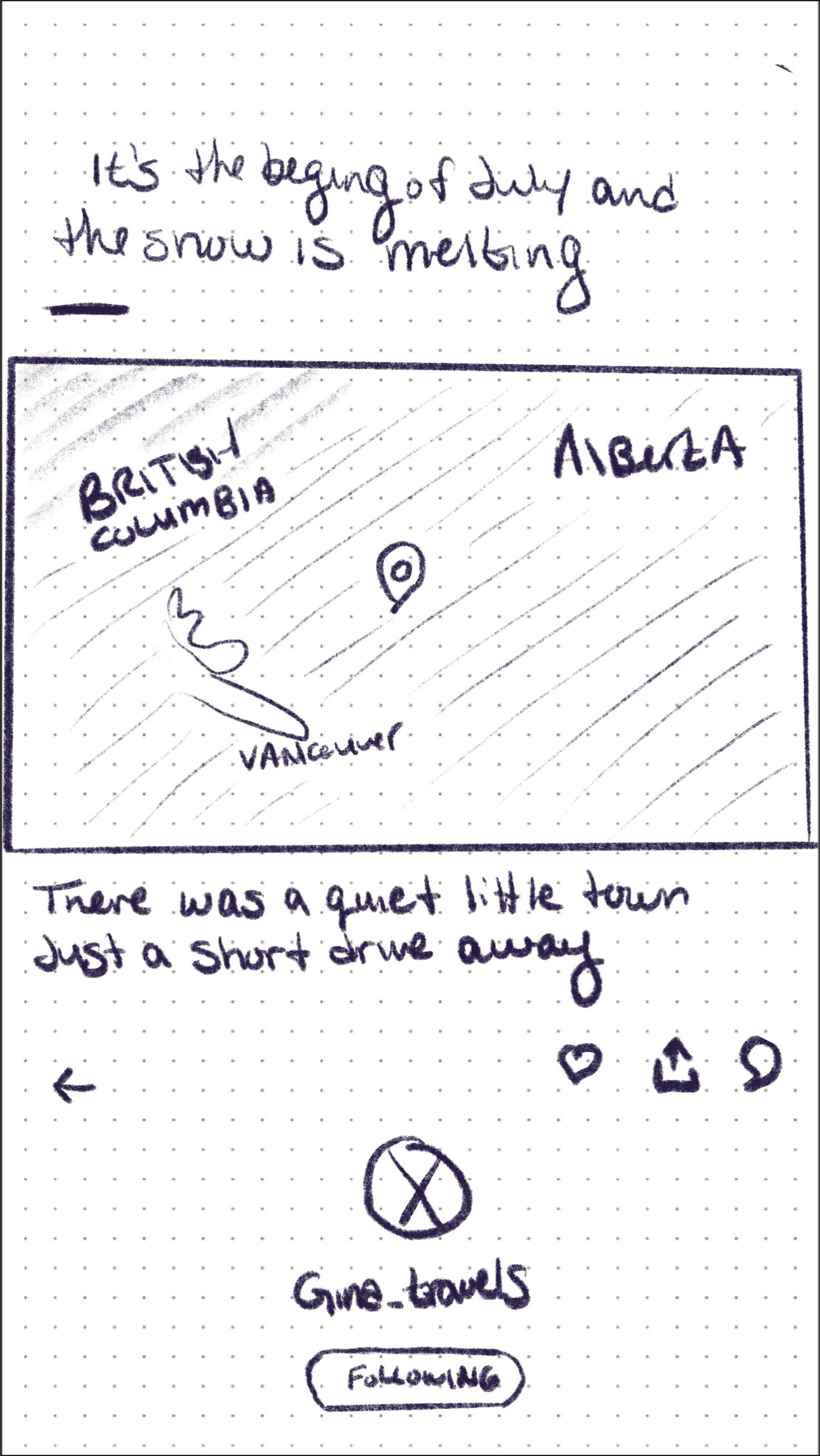
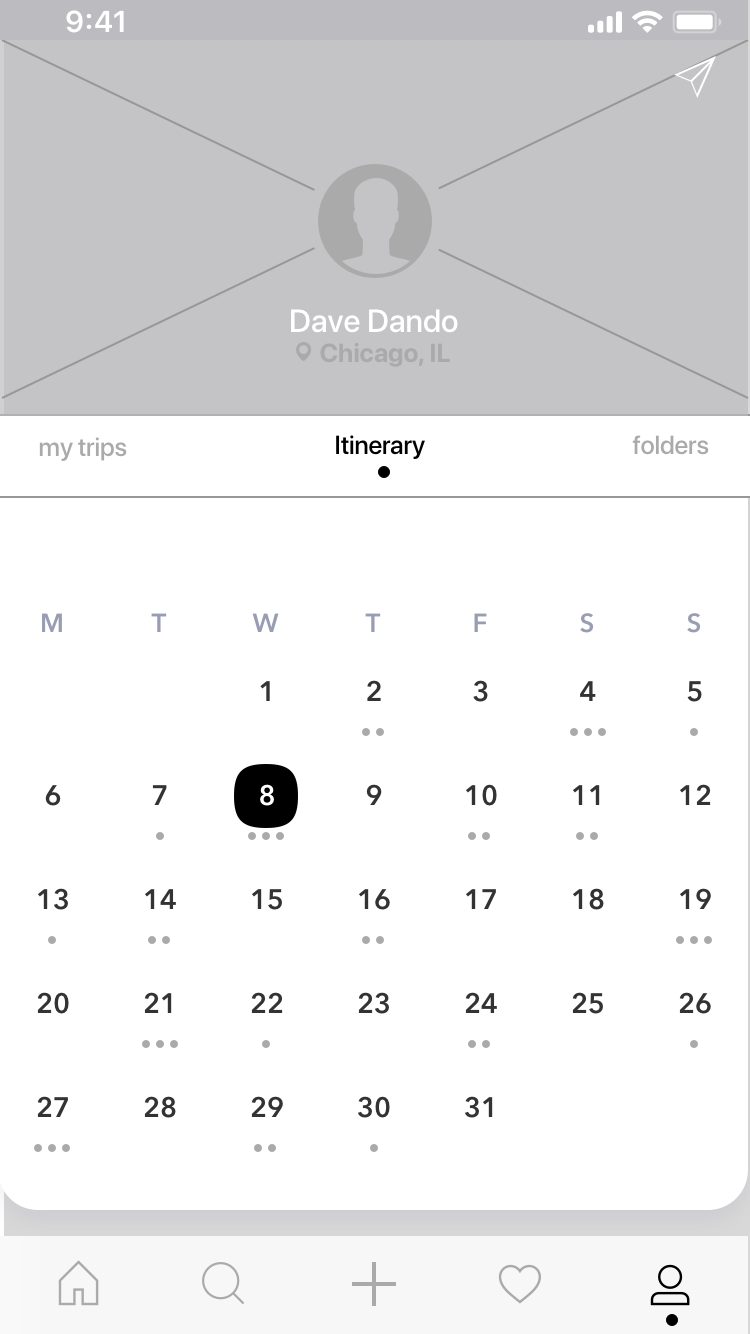
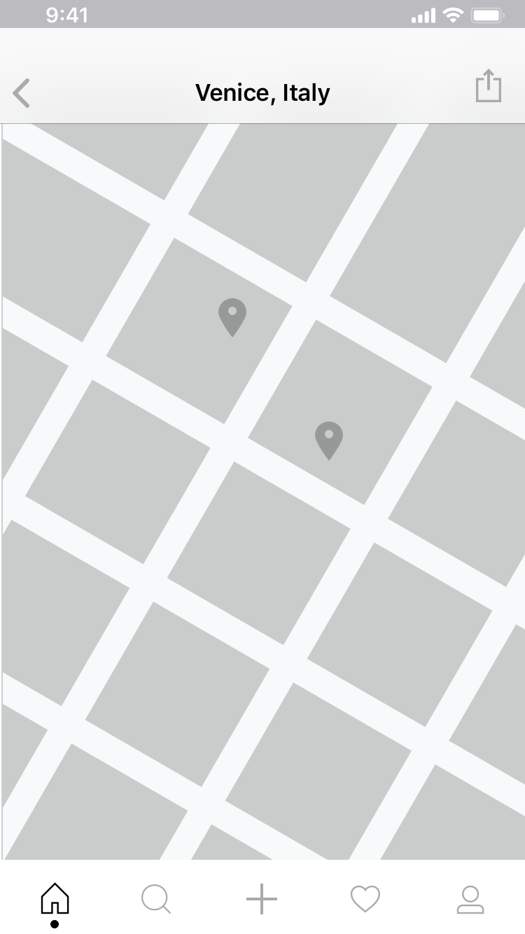
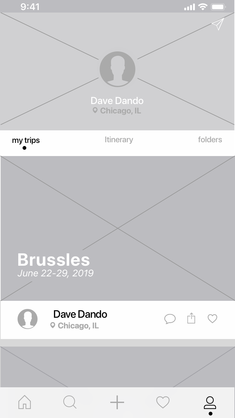
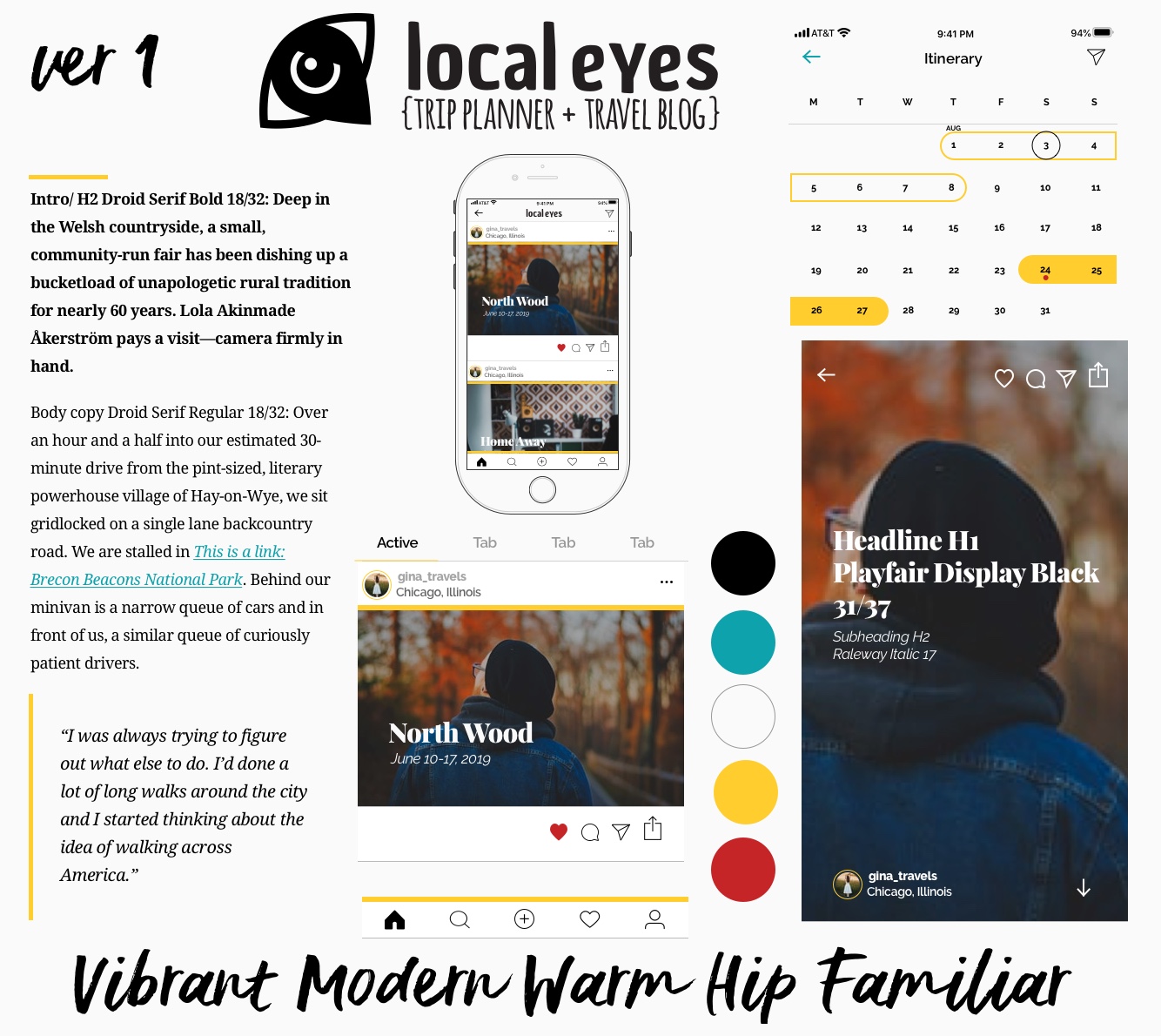
Homepage
Step 02
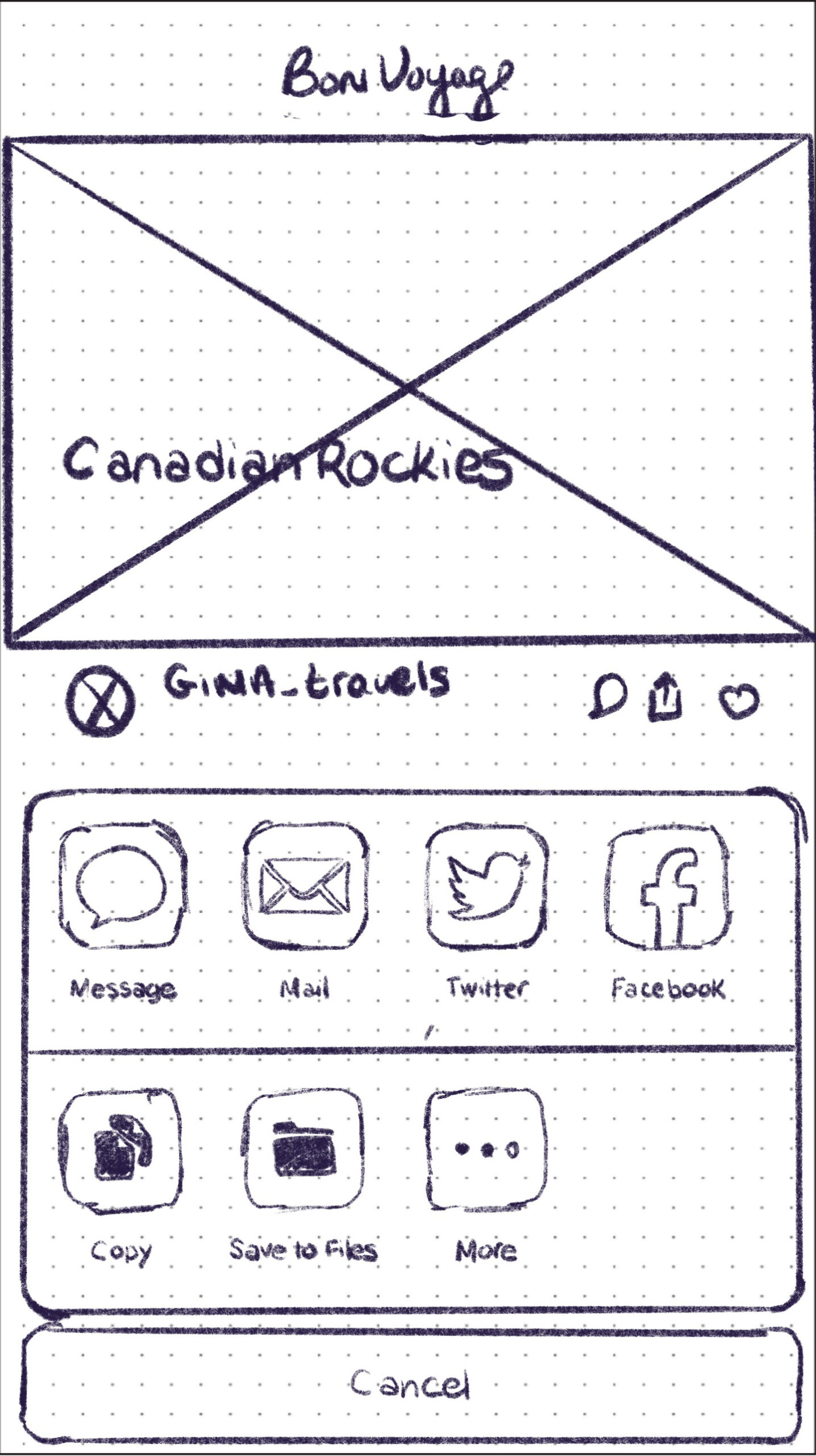
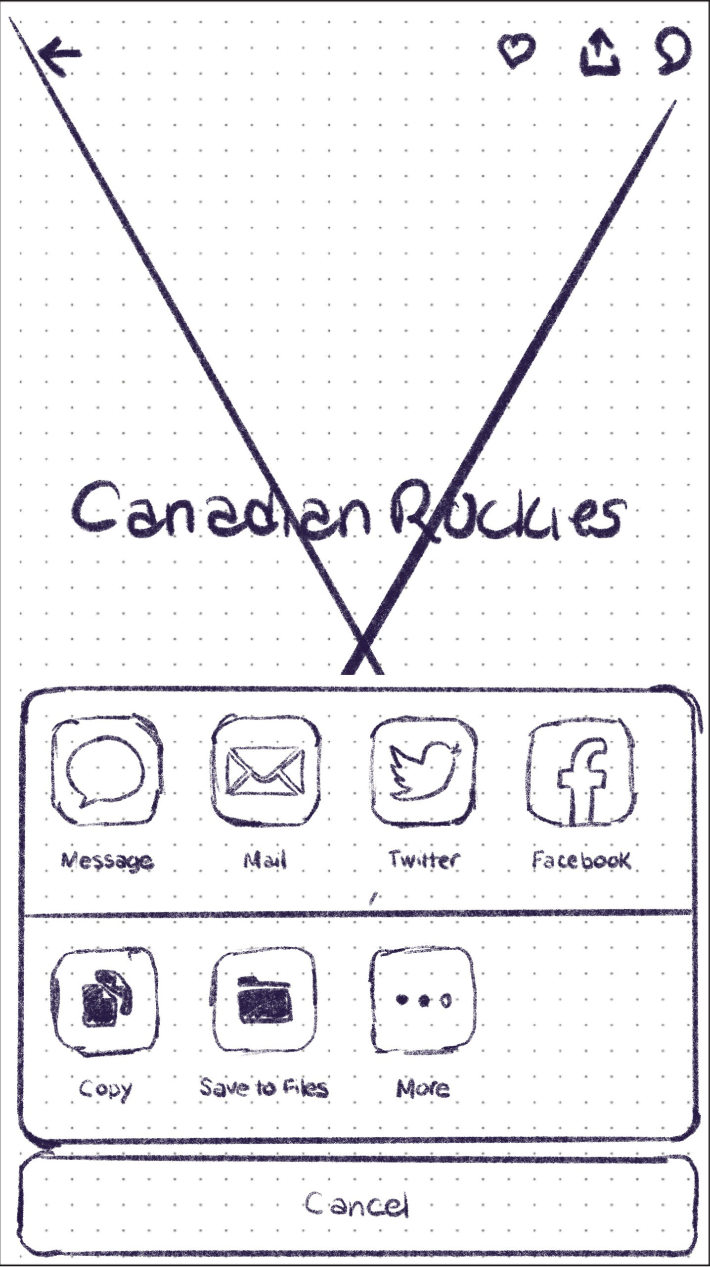
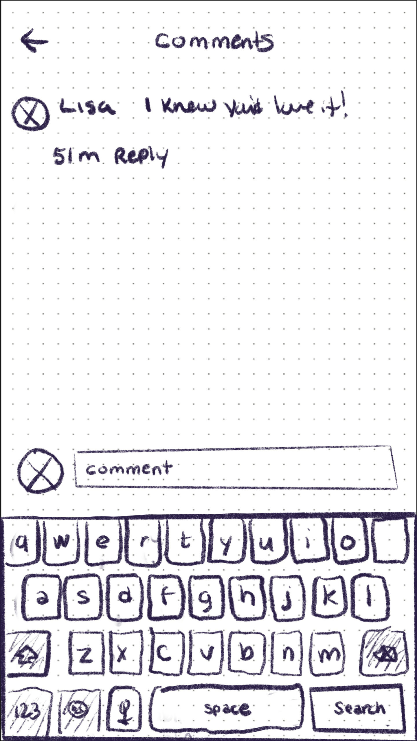
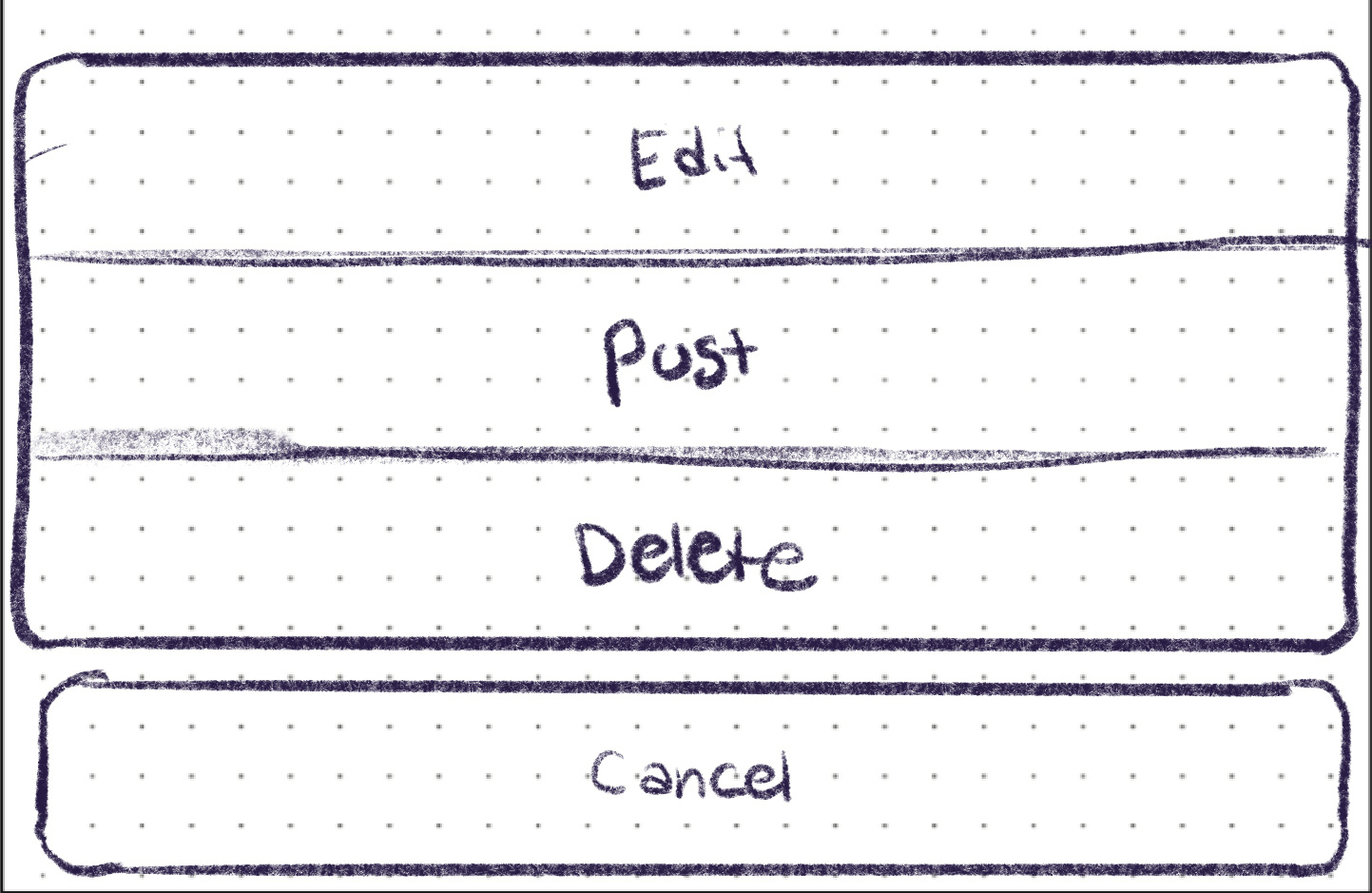
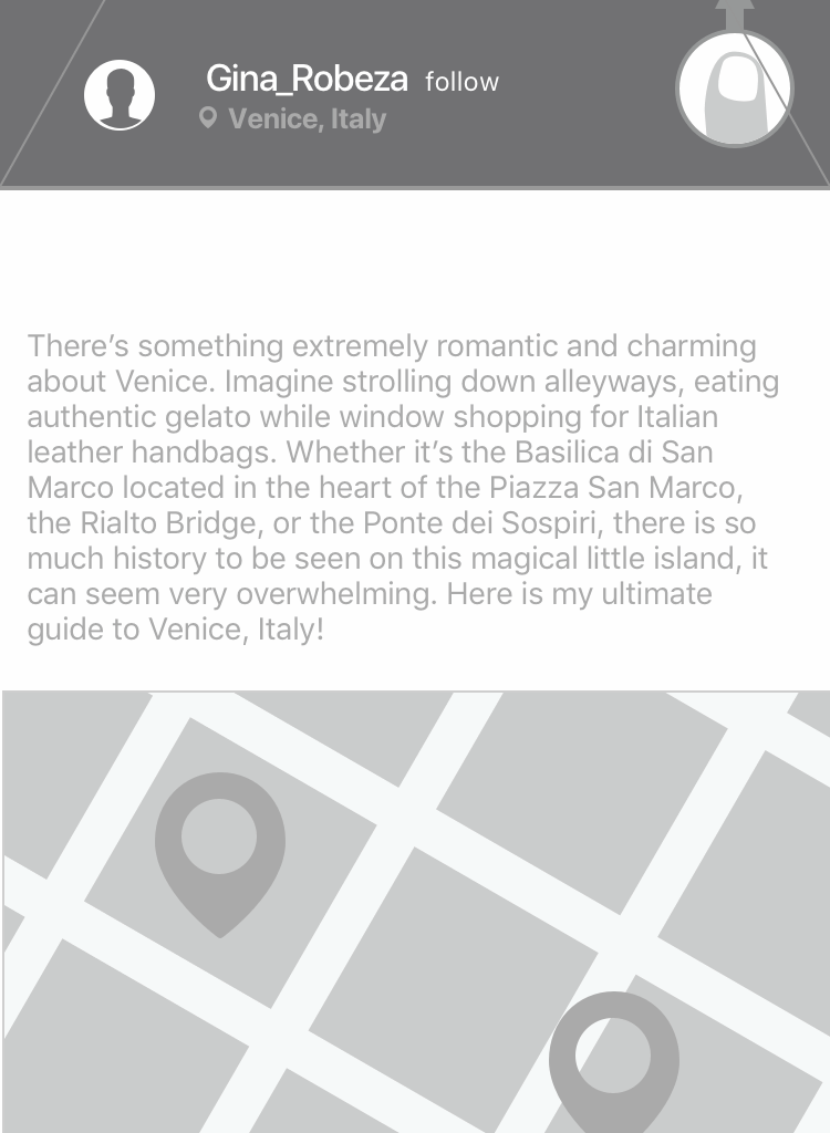
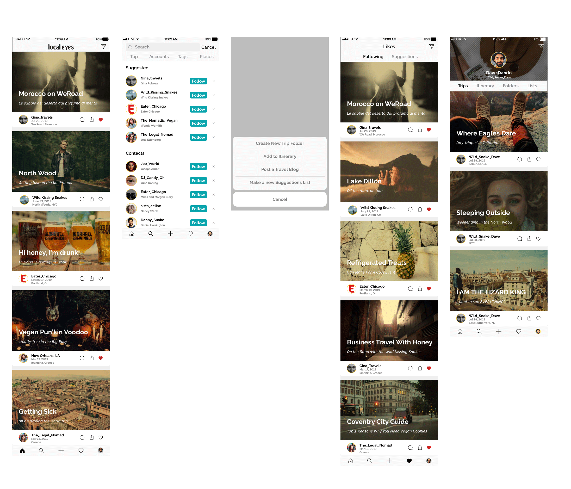
Tap menu on post
Step 03
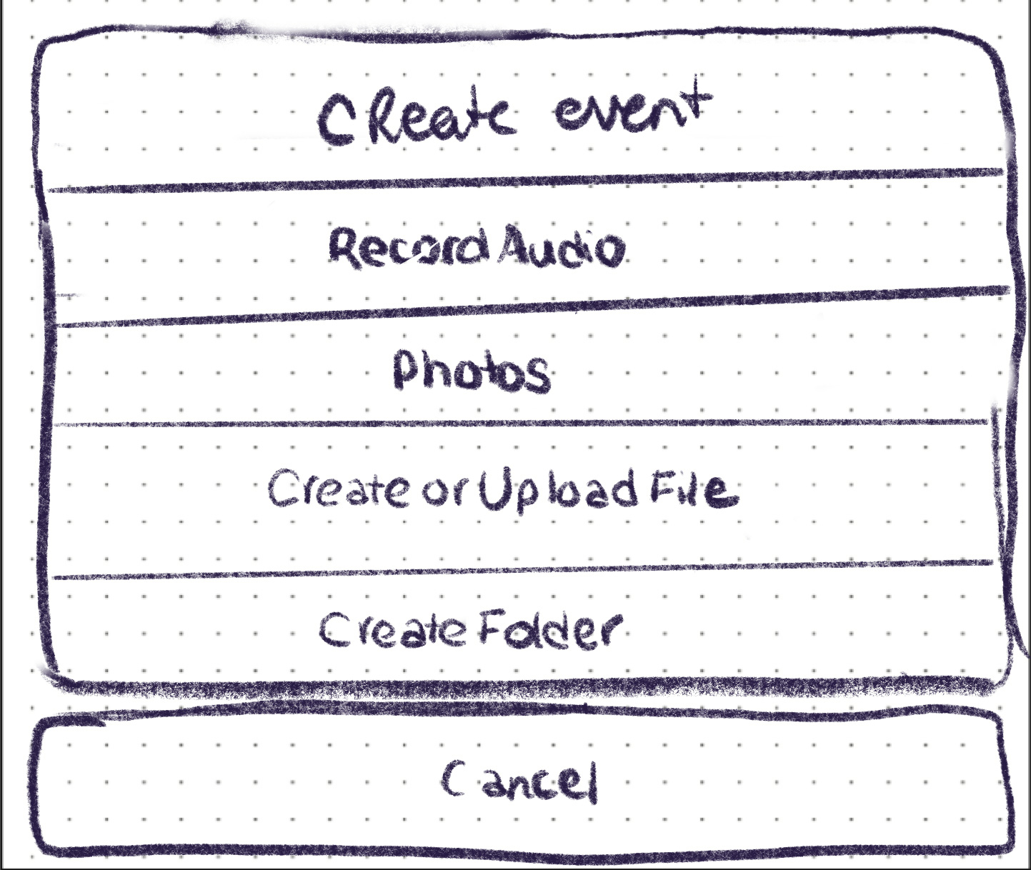
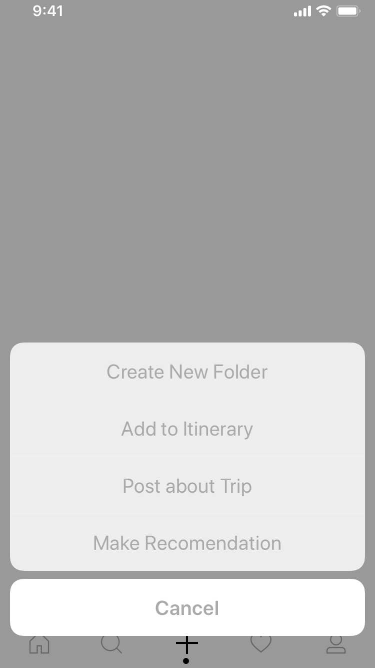
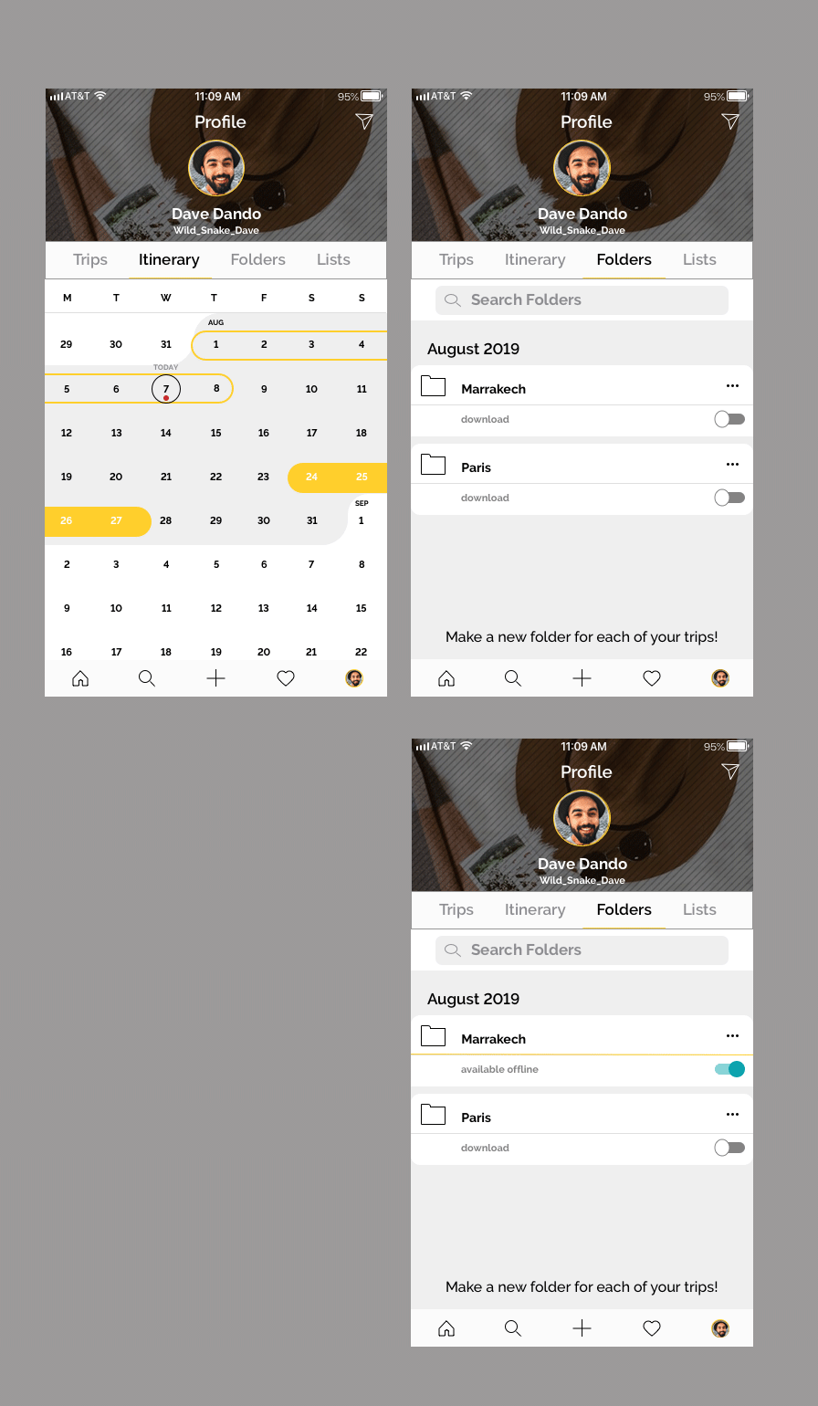
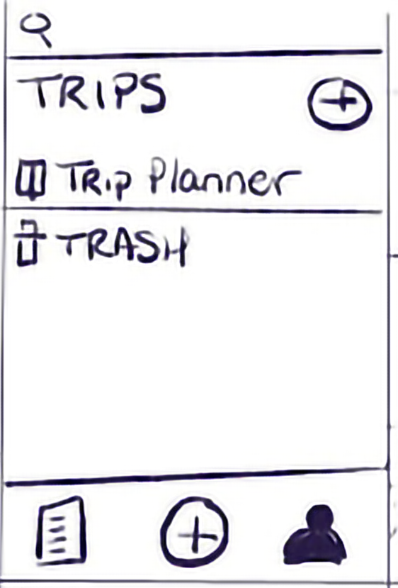
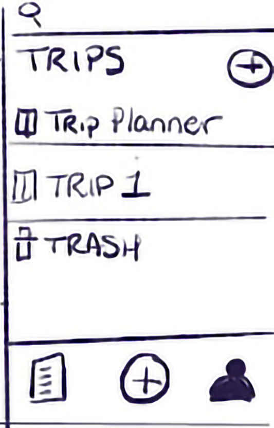
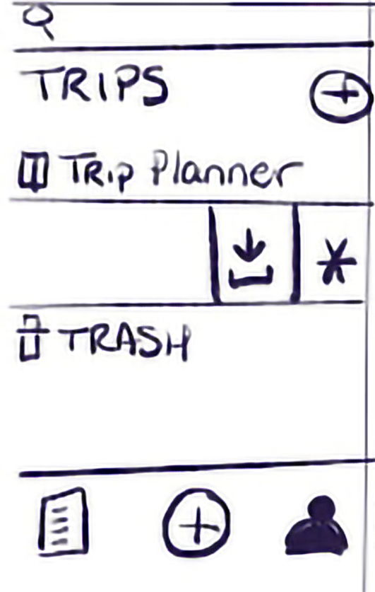
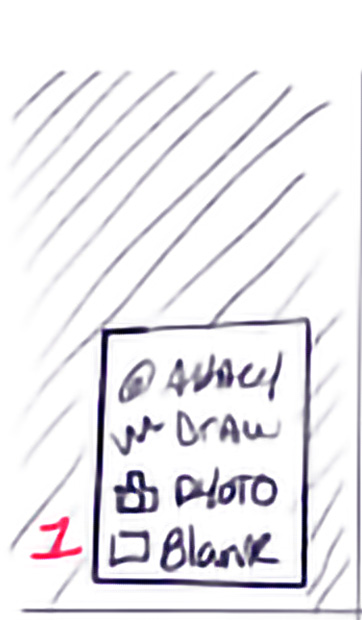
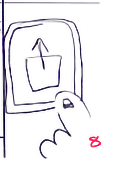
Create New Folder
Step 04
Folder screen
Step 05
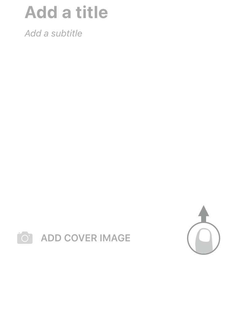
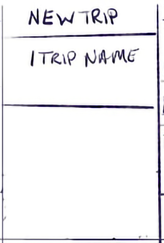
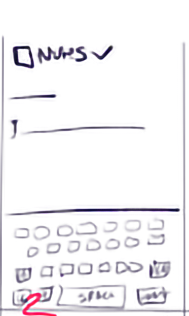
Enter folder name
Step 06
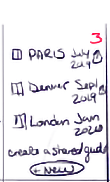
Folder appears in profile
Step 07
Tap "Create"
Step 08
Enable offline?
Step 09
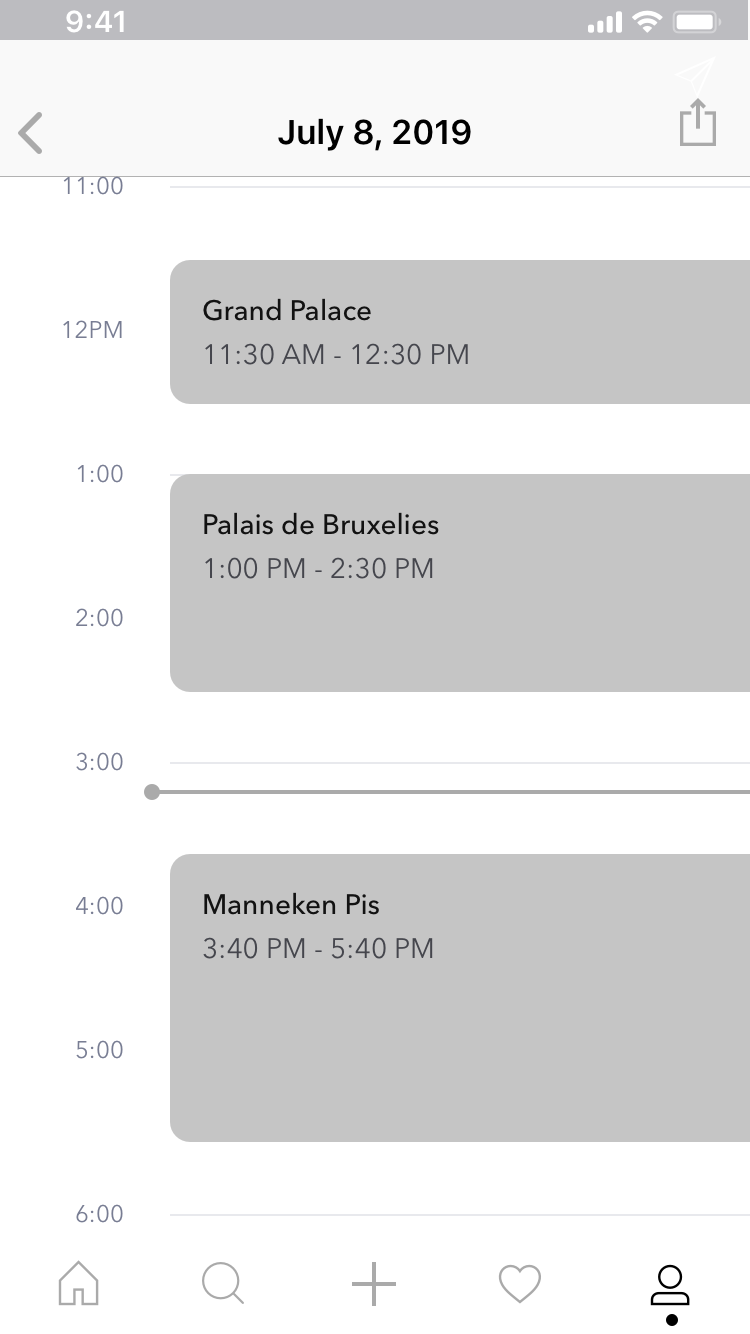
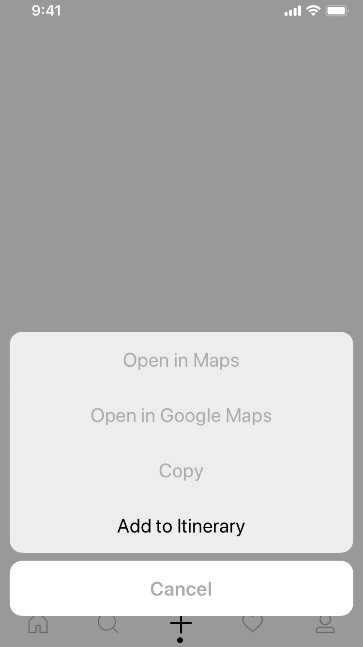
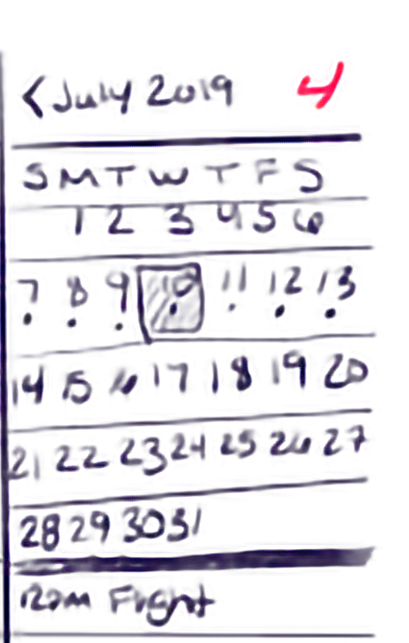
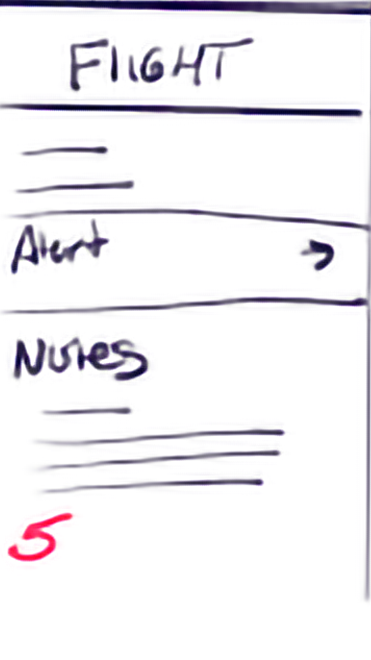
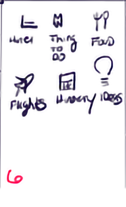
User Task: Add a new event to an itinerary


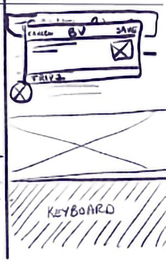
Add Folder Mockup Flow
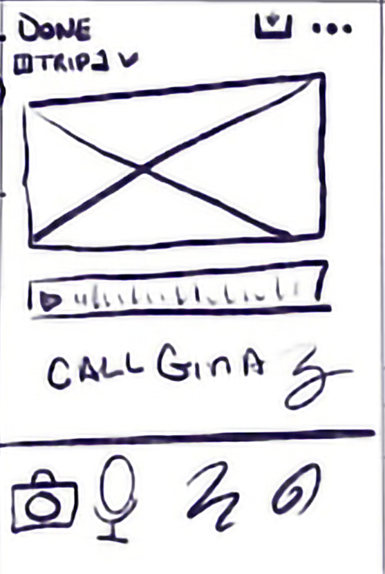
Add Itinerary flow Screens
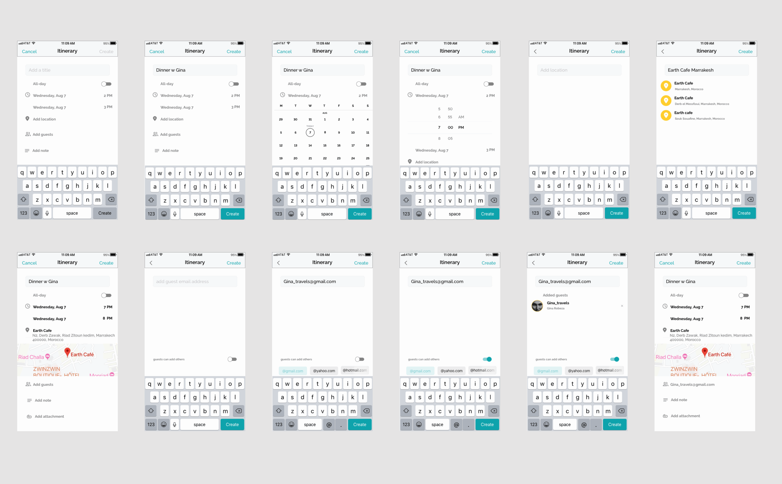
Add Screens
Add to Itinerary mockup flow
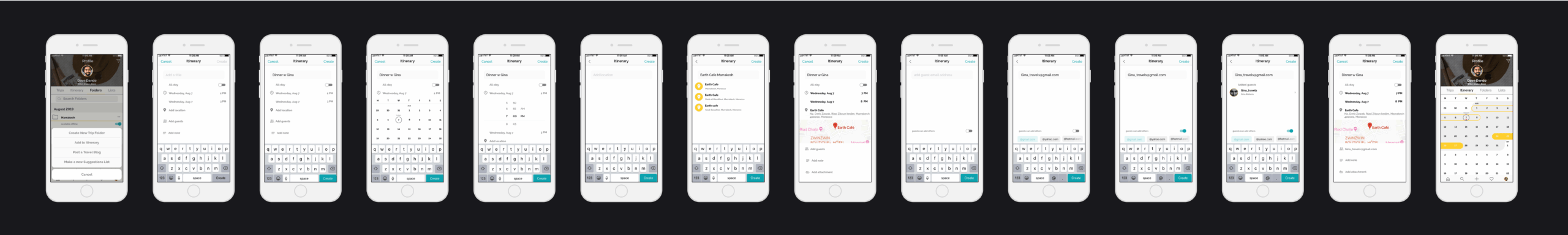
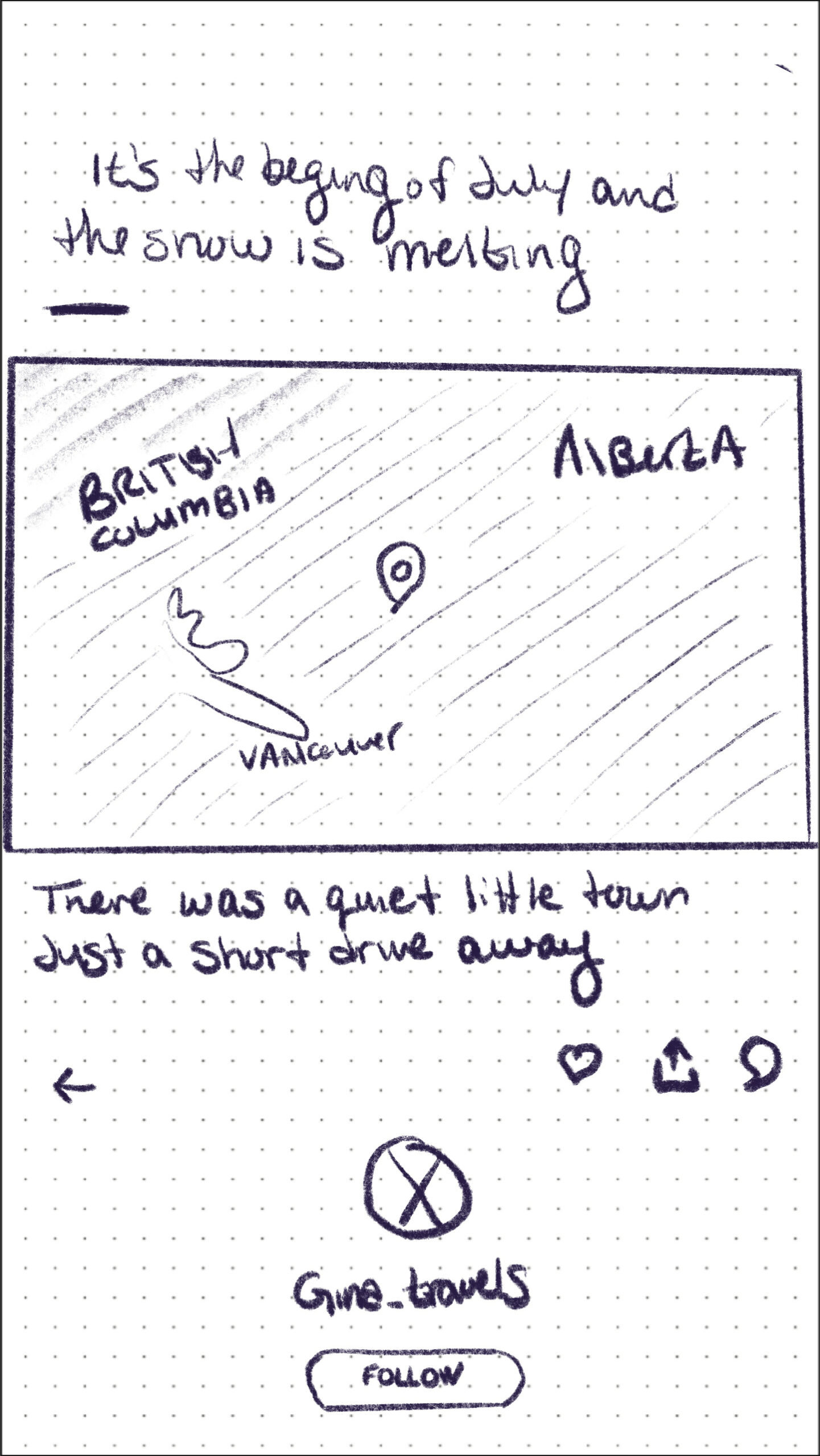
Blog Screens
Main Social Nav Screens
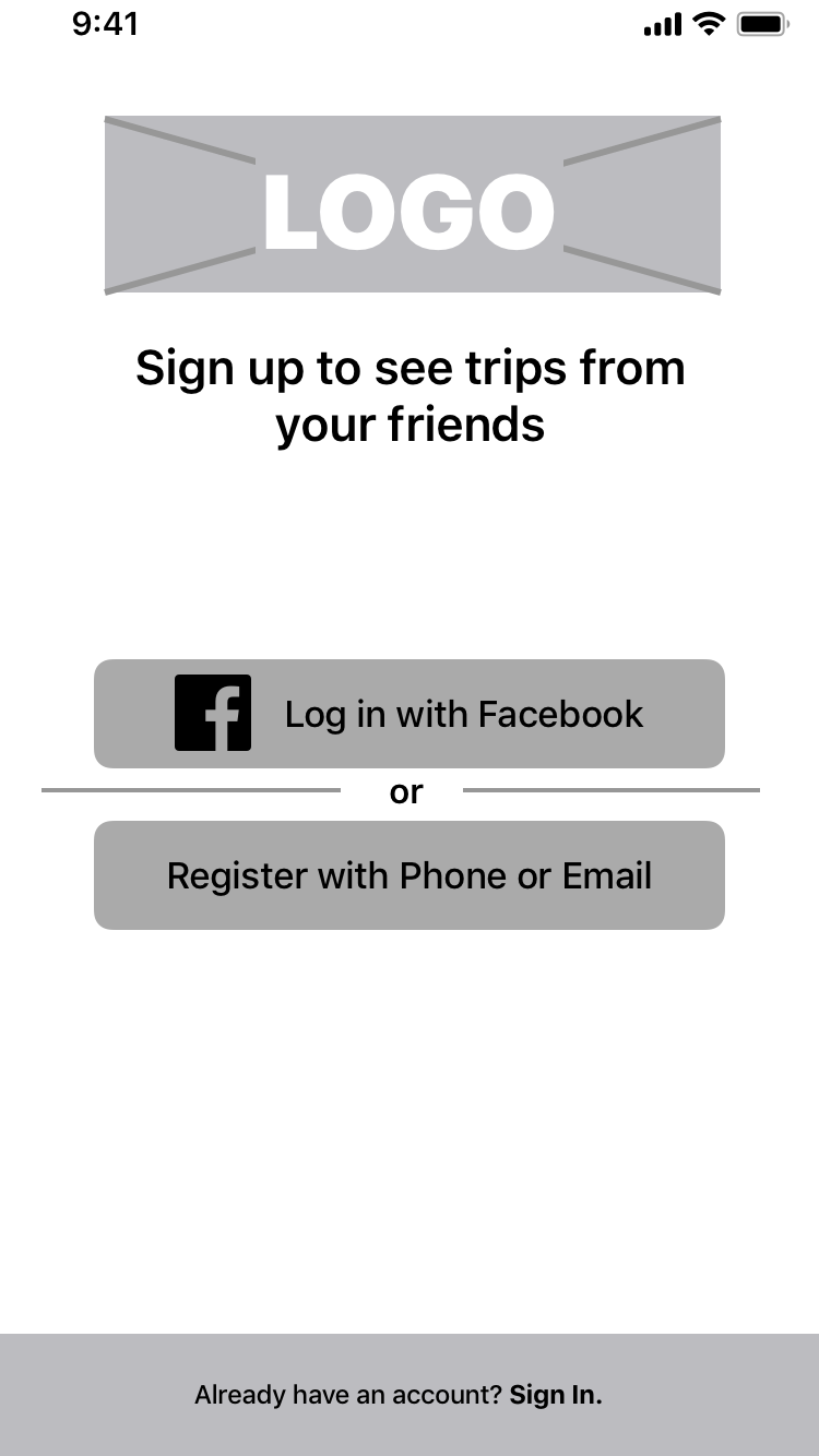
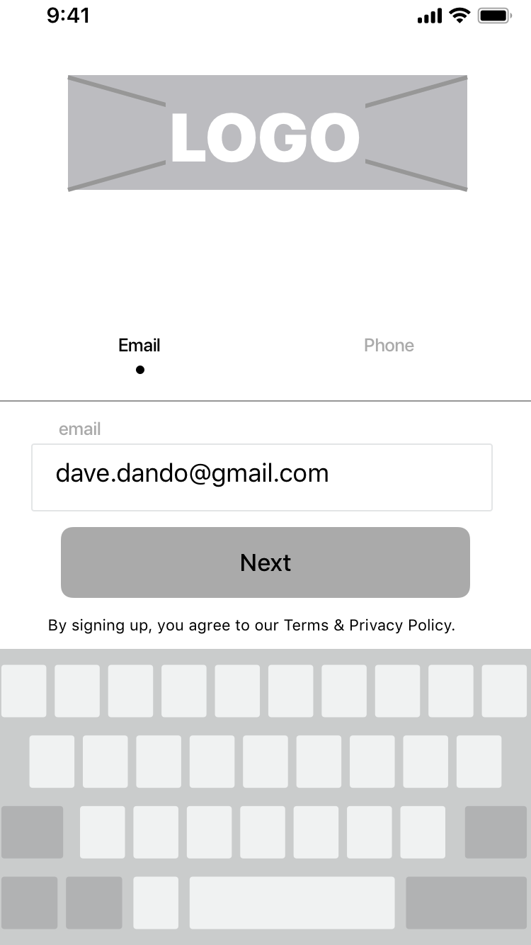
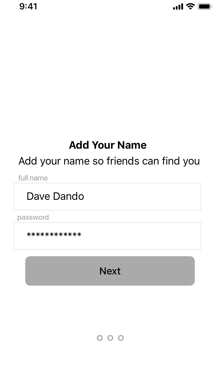
Onboarding Screens
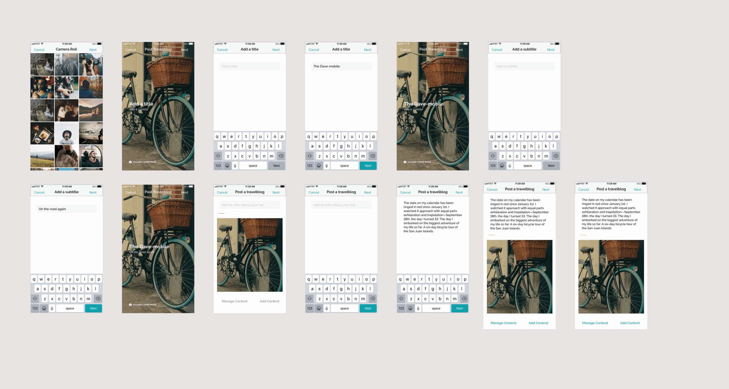
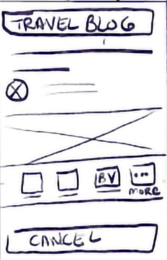
Post Travelblog Screens
Profiles Screens
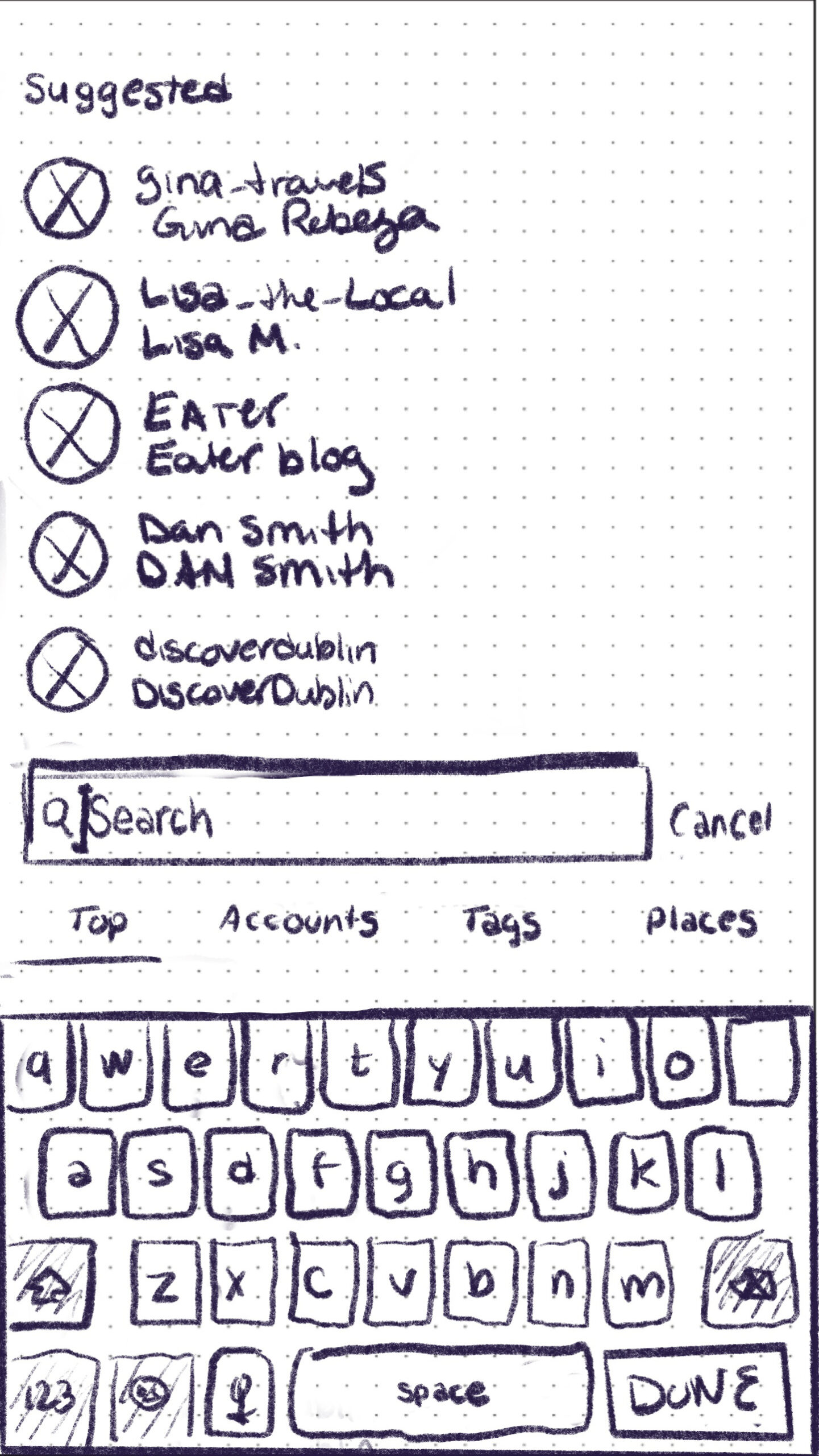
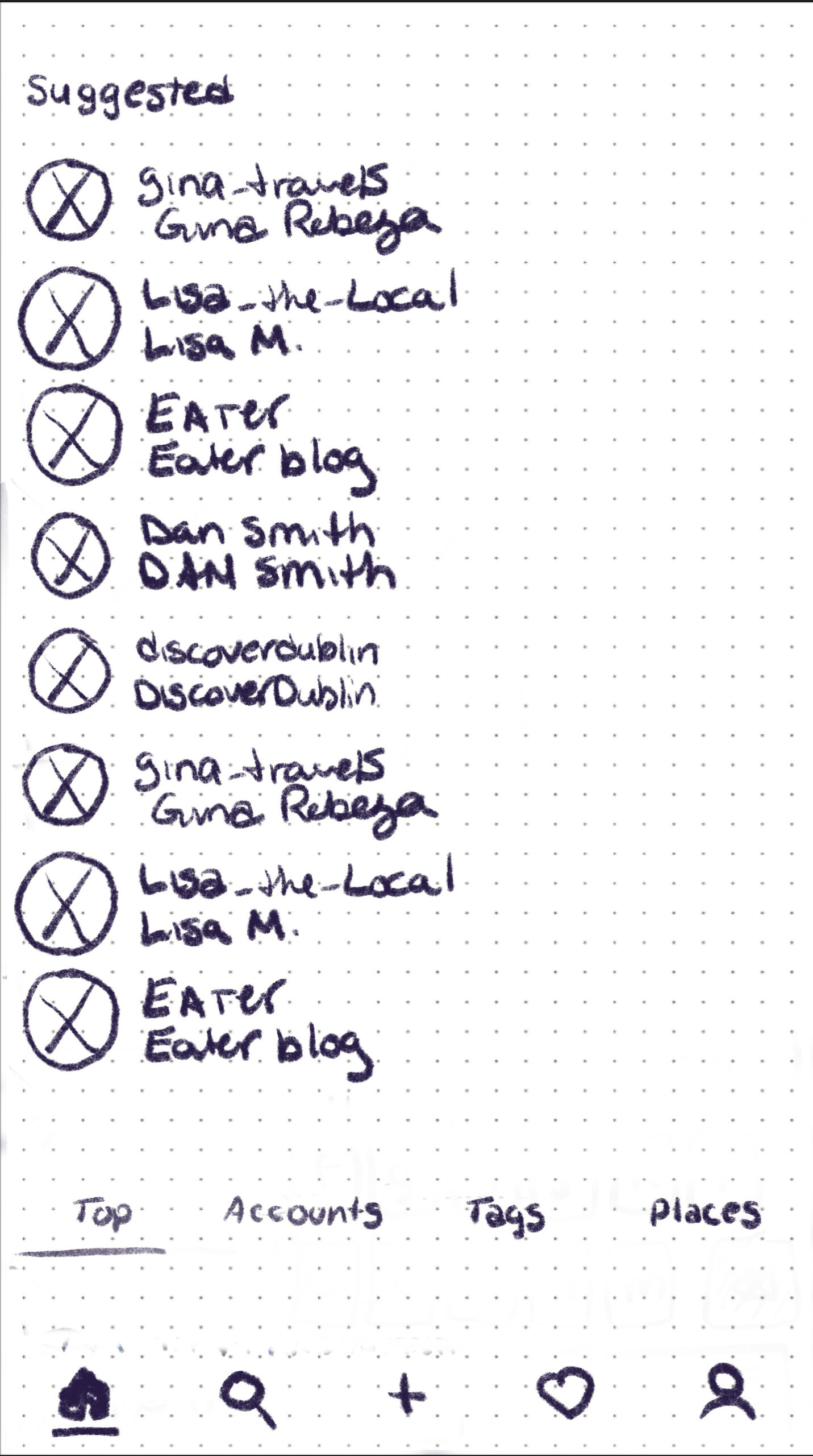
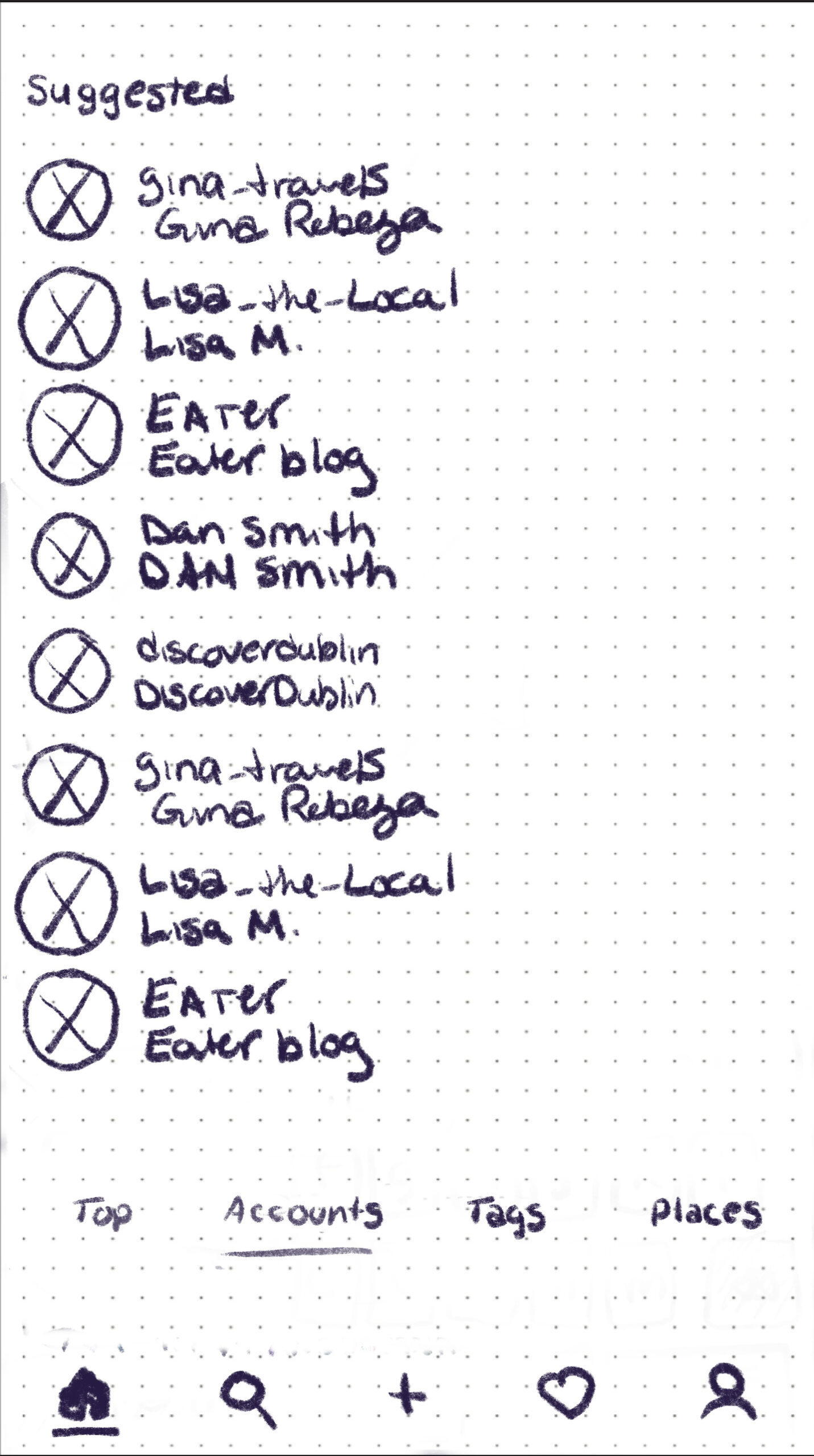
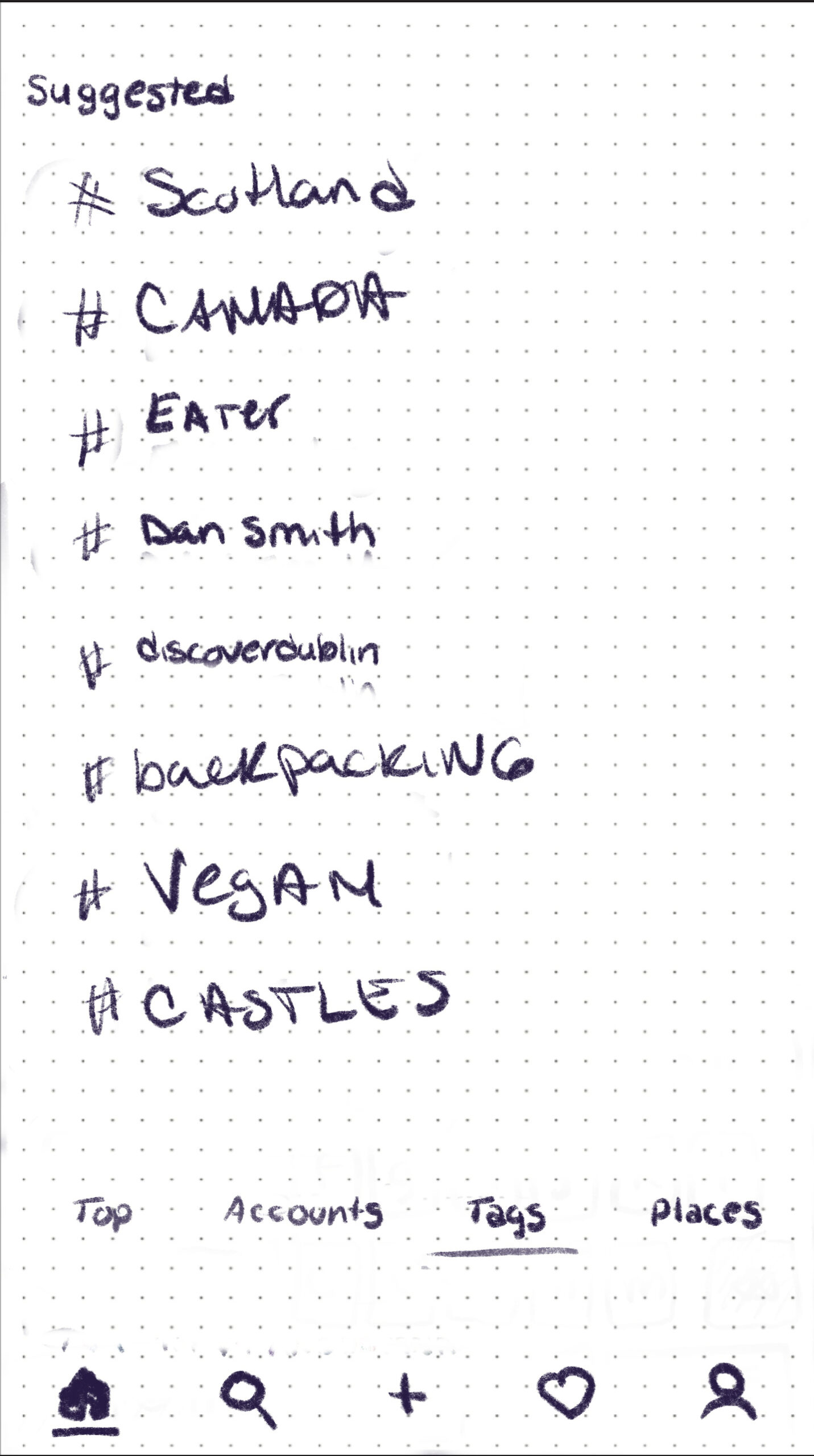
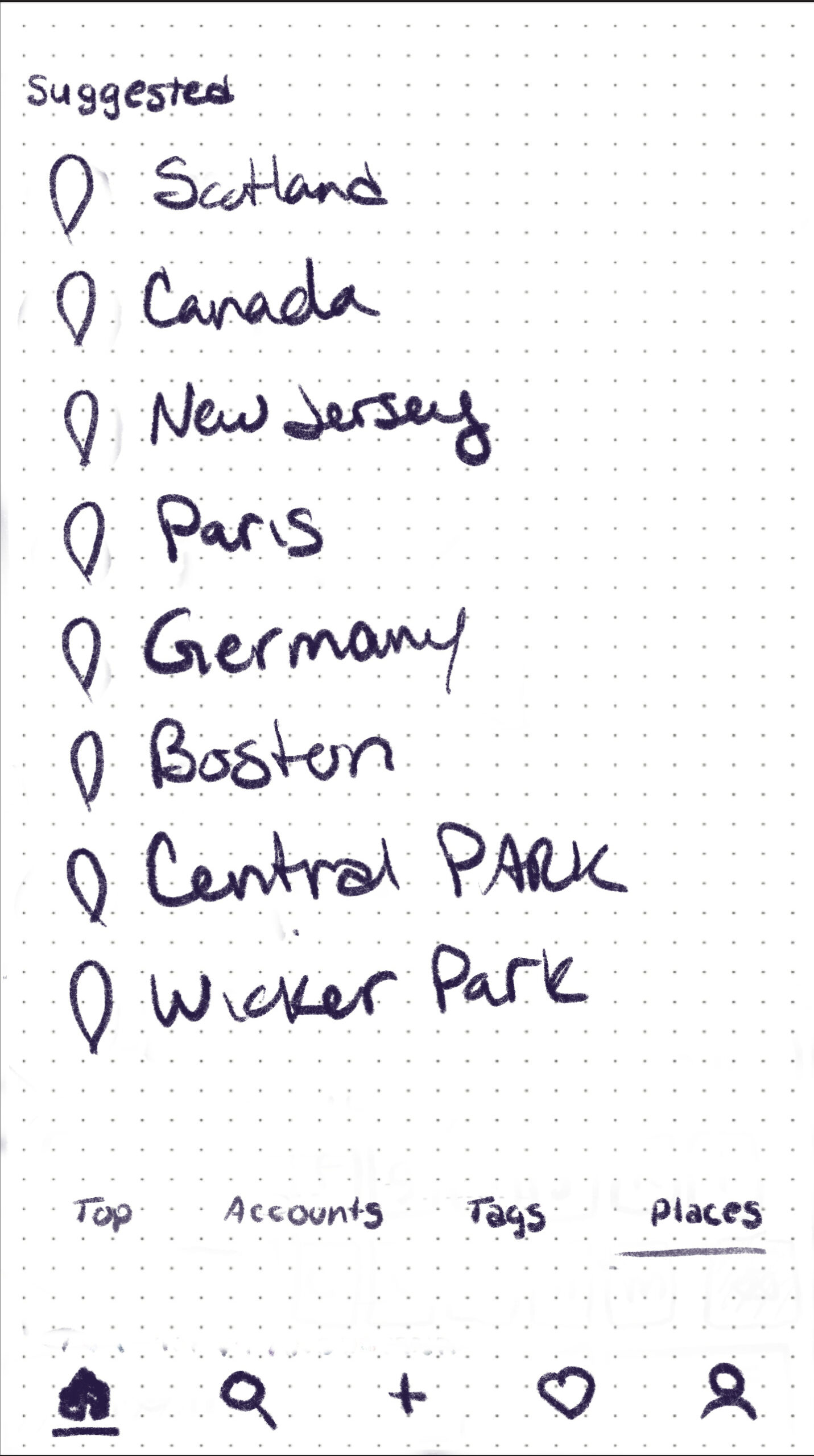
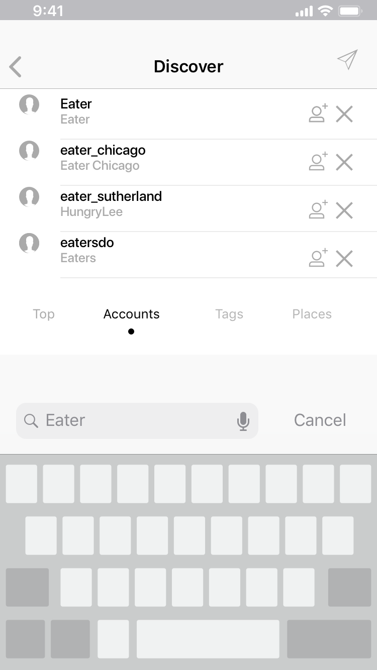
Search Screens

