|
Direct Competitors
|
||
|---|---|---|
|
|
|
🧩 Challenge
Users of the YourLocal app were unsure how to navigate the main flow, what the app’s value proposition was, and how their purchases contributed to sustainability. Visually, the app felt impersonal and didn’t align with the brand’s mission of making food recovery feel positive, easy, and community-driven.
Pain Points
- No onboarding or reward explanation
- Cold, generic visual tone
- Navigation inconsistencies
- Lack of emotional engagement
- Difficulty browsing or understanding available offers
🛠️ Approach
To address these issues, I focused on surfacing emotional tone and usability in tandem. I began by evaluating the app’s positioning through visual competitive analysis, then layered in contextual domain research on sustainability and user behavior to understand the motivational gaps. From there, I developed a set of guiding design principles to ground all future creative decisions.
I tested emotional tone through moodboards and style tiles, synthesized user reactions and preferences, and then applied those insights to high-fidelity screen design, microinteractions, and component systems. I conducted multiple rounds of usability interviews and click testing to refine flows and visual clarity throughout the user journey. All feedback was synthesized into updated designs and documentation for future iterations and handoff.
🔍 Discoveries
Research & Synthesis: Visual Competitive Analysis
To better understand the design landscape and surface visual opportunities for YourLocal, I conducted a visual competitive analysis of both direct and indirect competitors. This analysis focused on layout, iconography, navigation, tone, and interaction design.
Direct Competitors: Karma, Food for All, and Go MKT
- Food for All used horizontal scrolling with map integration to show real-time availability. Their onboarding featured fun illustrations and microinteractions.
- Karma utilized a bold, colorful interface with icon-based filtering and accessible navigation.
- Go MKT prioritized white space, clean layout, and bold CTAs—all three used rounded sans-serif fonts for friendliness and readability.
Opportunity:
Improve onboarding using illustrations, animations, or micro-interactions. Clearly indicate when an item is sold out or a store is closed, and delay payment info requests until after user trust is established.
|
Indirect Competitors
|
||
|---|---|---|
|
|
|
|
|
|
|
||
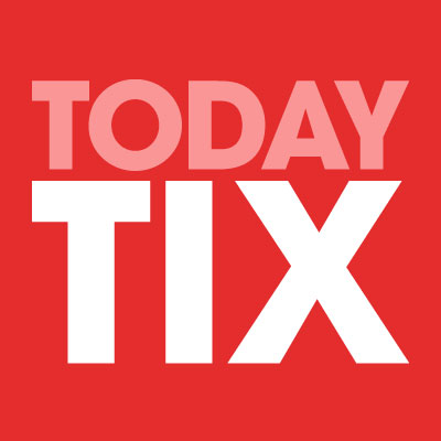
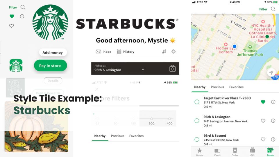
Indirect Competitors: Starbucks, Ritual, Today Tix, and Groupon
Starbucks uses minimal onboarding and strong loyalty incentives.
Ritual gamifies rewards with delightful animations.
Today Tix offers tiered deals and incentives unlocked via social sharing.
Groupon centers around discovery and gifting, with strong CTA flows.
Recommendation:
Lean into emotional incentives and visual storytelling. Make use of gamified rewards, maps for discovery, and clear iconography. Explore sustainability themes in both tone and imagery to enhance trust and mission clarity.
Key Takeaways
- Easy to use with clean layouts
- Fun and casual
- Trustworthy
- Social incentification
Opportunities
- Improve onboarding with illustrations & micro-interactions
- Show users social contributions that benefit to the planet.
- Visually express when a deal is no longer available or if a place is closed.
- Utilize an engaging reward system.
- Use a filter-based, map-based interface
- Consider social media sharing ways towards incentivization
🌐 Domain Research
Sustainability and user behavior were critical themes. According to the EPA, 94% of food waste ends up in landfills. ReFED prioritizes recovery strategies—YourLocal’s model supports this by reselling surplus food locally.
Target Users: Young adults and women with higher education levels. They care about sustainability but want ease and authenticity. Many overstate eco-habits, creating a disconnect between values and behavior.
Key Insight: Users want sustainable choices to feel rewarding and intuitive—not like a burden.
Target Users
- Want environmental protection to be easy, and do not want to entail major sacrifices while helping the environment
- Are eager to learn about environmental impacts
- Would like to buy purpose-driven brands that advocate sustainability
🧭 Design Principles
As I moved from research into ideation, I developed a set of guiding principles to keep the design aligned with both user needs and the mission-driven nature of YourLocal. These principles helped frame every design decision, from animation timing to copy tone.
Motion Sparks Emotion
Animations and microinteractions should spark joy—never distract. When used thoughtfully, motion adds personality and energy to the experience, encouraging continued engagement and delighting the user in small but meaningful ways.
Enduring Quality
The design should be grounded in how people live and interact with food apps every day. By focusing on clarity, sustainability, and visual integrity, I aimed to create an interface that feels honest, human, and built to last.
Effortless
Reduce cognitive friction with consistency and predictability.
Consistent patterns allow users to feel confident navigating
Predictable flows reduce hesitation and support momentum
Smart affordances gently guide the user toward success
Personalization
Users should feel that their actions matter. The experience should reflect not just savings, but individual contributions toward environmental change. The interface celebrates each user’s small wins and fosters a sense of ownership: “This is uniquely Yours.”
Motion = Emotion
Enduring Quality
Effortless
Personal
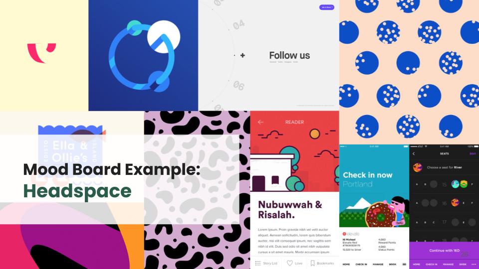
🧑🎨 Style Exploration & User Interview Synthesis
To ensure the brand direction for YourLocal felt aligned with both the company’s mission and user expectations, I conducted multiple rounds of qualitative testing using mood boards and style tiles.
🎯 Testing Goals
Determine which visual direction users found most appealing
Identify emotional responses to branding elements
Explore alignment between style and mission-driven values
Uncover any potential disconnects in tone or usability
🗂️ Method
We conducted moderated interviews and presented participants with a variety of mood boards and early style tile designs.
Participants selected adjectives from a controlled list and offered open-ended feedback. We then tagged all responses as positive, negative, or neutral to identify patterns.
Objective
- How does each design concept make users feel?
- Which design concept do users prefer?
Reaction Testing: How does this design make you feel?
- Show users design concepts
- Present users with 15-25 relevant words
- Instruct participants to pick five words that best describe how they feel about the design
Preference Testing: Which design do you prefer?
- Ask users to choose which design they prefer.
- Measures aesthetic appeal and/or how well designers communicate a specific message or idea.
- Key benefit is gaining feedback early on in the process.
- Quantitative feedback
- Qualitative feedback: obtained by asking why participants prefer a certain design
|
Tag: Positive (brand/design principles)
|
Tag: Negative (40%)
|
Tag: Neutral
|
|---|---|---|
|
upscale
|
bland
|
static
|
|
reliable
|
untrustworthy
|
clean
|
|
personal
|
emotionless
|
chic
|
|
joyful
|
impersonal
|
bold
|
|
timeless
|
cheap
|
modern
|
|
easy
|
generic
|
environmental
|
|
creative
|
too complex
|
unique
|
|
|
outdated
|
|
|
|
confusing
|
|
|
|
stressful
|
|
What we tested:
- Mood Boards*
- Style Tiles
Moodboards:
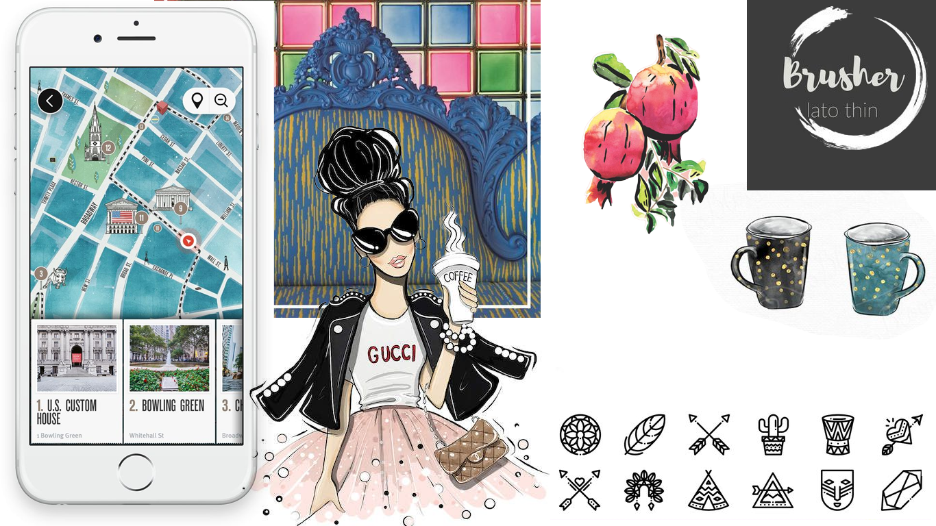
An arrangement of images, materials, pieces of text, etc. intended to evoke or project a particular style or concept.
Style Tiles:
A design deliverable consisting of fonts, colors and interface elements that communicate the essence of a visual brand for the product. Style Tiles are similar to the paint chips and fabric swatches an interior designer gets approval on before designing a room.
🖼 Mood Board Testing Results
We tested two primary directions:
1. Boutique/Chic Aesthetic
89% identified the mood as upscale
78% saw it as chic and 56% as modern
However, 33% also noted it felt impersonal or emotionless
Open feedback mentioned it felt “professional” but “not male-friendly” and “cold”

2. Boho/Creative Aesthetic
78% of participants described it as joyful and creative
100% of participants used open word choice to describe their impressions
Users called it artistic, inviting, fun, but some found it overcrowded or childish
This direction was preferred by 66% of participants for its warmth and uniqueness
“It feels more personal—like a creative mom made it. I’d actually want to use this.”

Boho Chic preferred to More Boutique
- Brighter colors
- Casual full color illustrations
- Slightly more detailed icon style as long as the meaning was clear
- Users were drawn to the creative style and color of the boho mood board but also requested a clean, familiar layout design
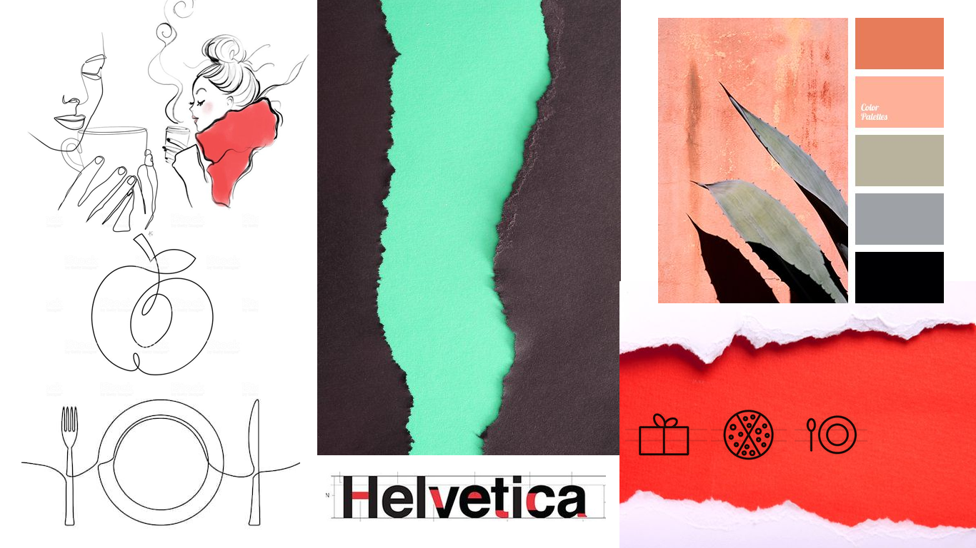
🧩 Style Tile Testing Insights
Across four sets of style tiles, key patterns emerged:
Visual clarity matters: Users favored designs with simple layouts, white space, and large food imagery—even when those same images appeared in other styles
Color sensitivity: Warm tones (especially corals/oranges) created joyful reactions, but bold color schemes often felt “busy” or “stressful”
Trust indicators: Users responded positively to environmental cues like hand-drawn globes and leaves, which supported the app’s sustainability message
Icon usage: Icons without labels caused confusion; clarity won over cleverness
“The peach tones make it feel happy. And the big food images stand out more because there’s less visual noise.”
Final style tile preferences leaned toward those that felt clean, simple, environmental, and easy to navigate.
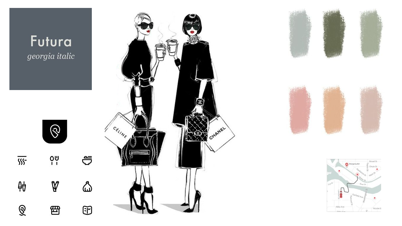
💡 Synthesis & Direction
The challenge became clear: strike a balance between an upscale, trustworthy visual identity and a personal, joyful experience. Based on these insights, I moved forward with a style direction that:
Blends soft color tones with white space
Highlights environmental illustrations and high-quality food photography
Avoids cluttered visuals, using icons sparingly and only with clear meaning
Adds subtle personalization cues (e.g. soft micro-interactions, warm tone)

Food Apps Used:
- YourLocal
- Grubhub
- Ritual
- Seamless
- Starbucks
- Delivery
- Food For All
Motivators
- Proximity
- Price
- Quality
- Health
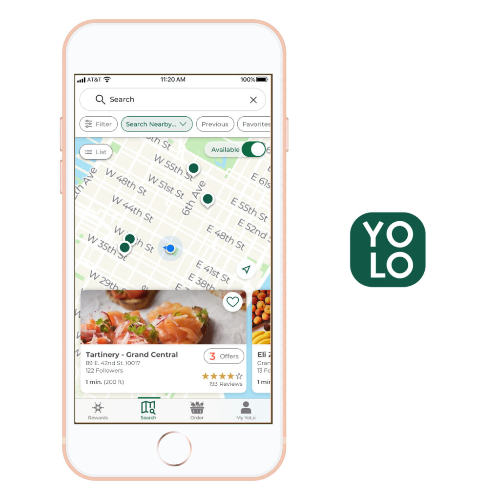
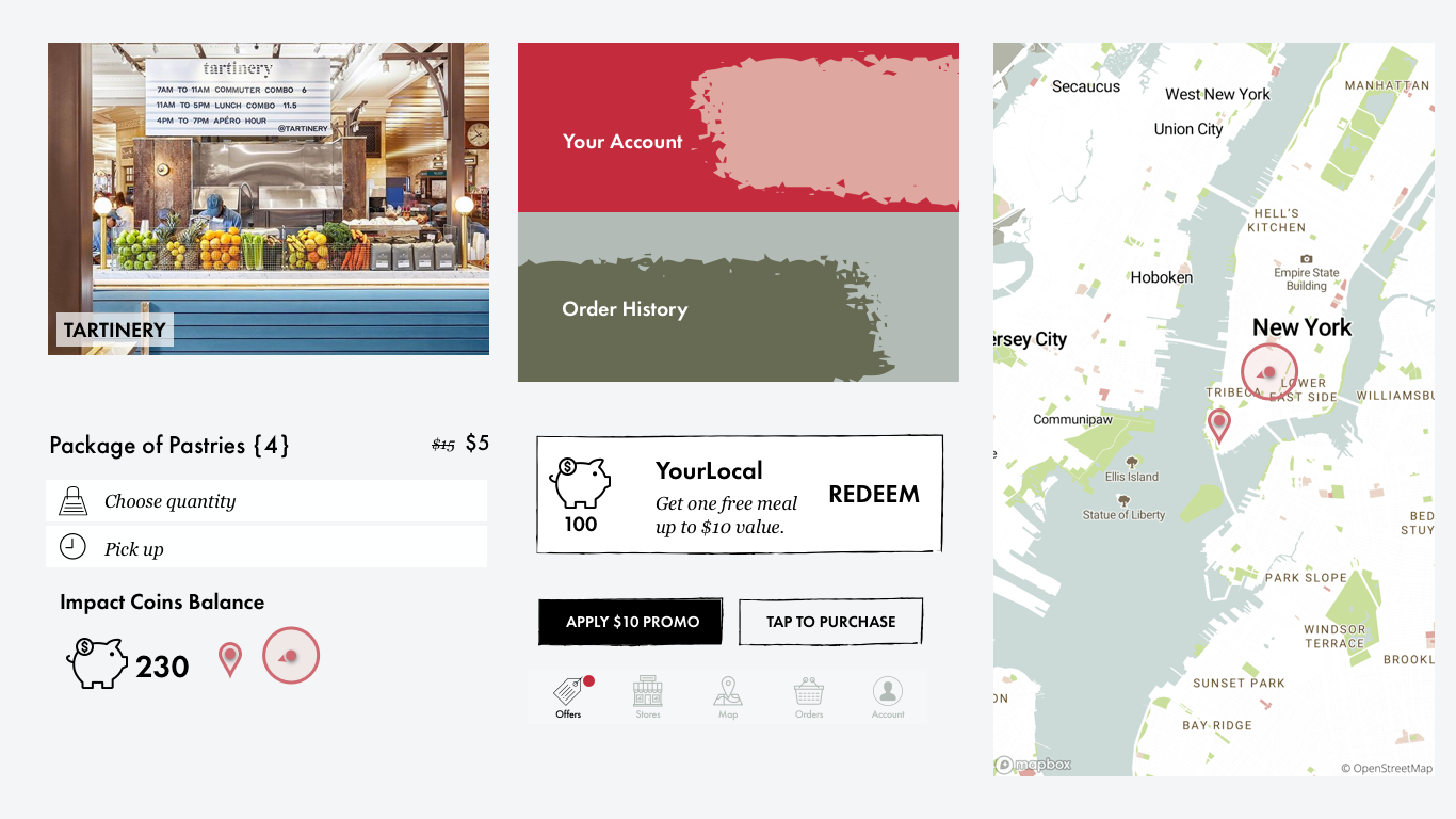
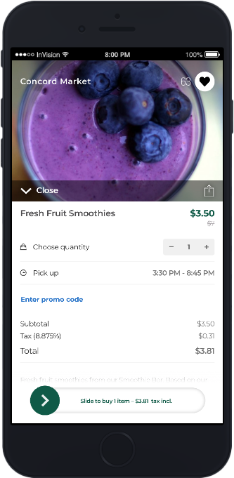
🧪 High-Fidelity Design & Usability Testing
To validate the visual and functional decisions made during earlier design phases, I developed a high-fidelity prototype and conducted a round of structured usability testing. This helped identify friction points, measure user comprehension, and assess how well the new design aligned with our brand principles.
🎯 Testing Goals
Can users successfully complete a pickup order?
Is the navigation intuitive across different entry points?
How do users feel about the interface?
Does the visual design reinforce our sustainability message?
- Do users understand how the interface functions?
- Can users complete the task (home to purchase)?
- How easy can users complete the task?
- How do users feel about the designs?
Navigation Testing: Can you complete the task?
- Show Users a screen and ask them how they would complete an action.
- “Imagine you’re using the a new YourLocal food take-away app. How would you go about placing an order for pickup?”
Revised First-Click Testing
- Did users click somewhere unexpected?
- Was there a particular element that misled them?
- Was the target element easy to overlook?
- Are there unnecessary elements on the page distracting users from the target?
How easy was it to complete the task?
- Extremely Easy
- Fairly Easy
- Somewhat Difficult
- Very Difficult
Reaction Testing: How does this design make you feel?
- Present users with 15-25 relevant words after Navigation Test
- Instruct participants to pick five words that best describe how they feel about the design
- How many brand and design principles are chosen?
upscale
timeless
bland
cheap
static
modern
reliable
easy
untrustworthy
generic
clean
environmental
personal
creative
emotionless
too complex
chic
unique
joyful
impersonal
outdated
bold
confusing
stressful
*other
Prototype
“Trouble with looking at selection of food is slow by scrolling.”

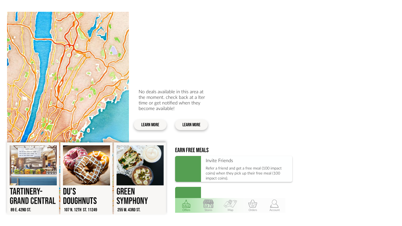
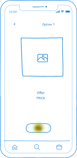
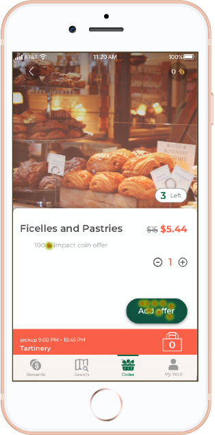
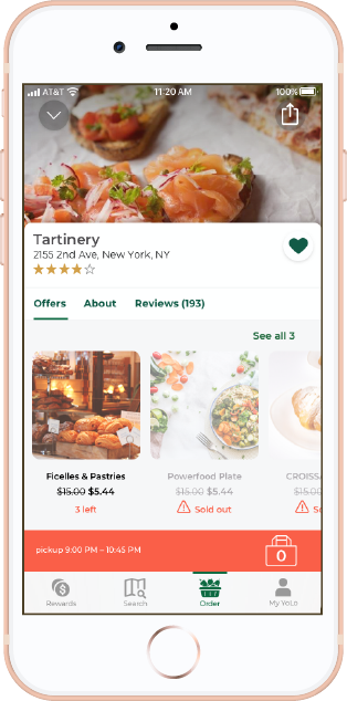
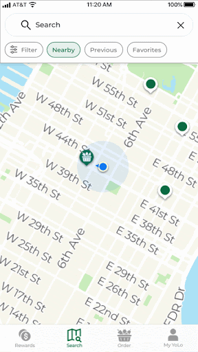
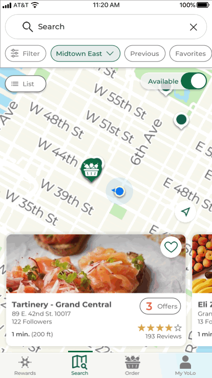
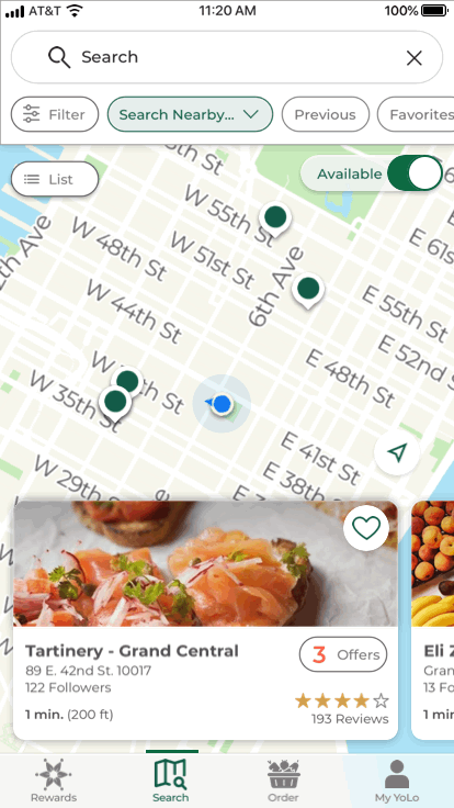
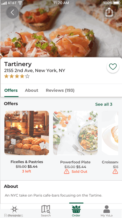
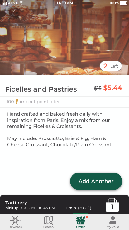
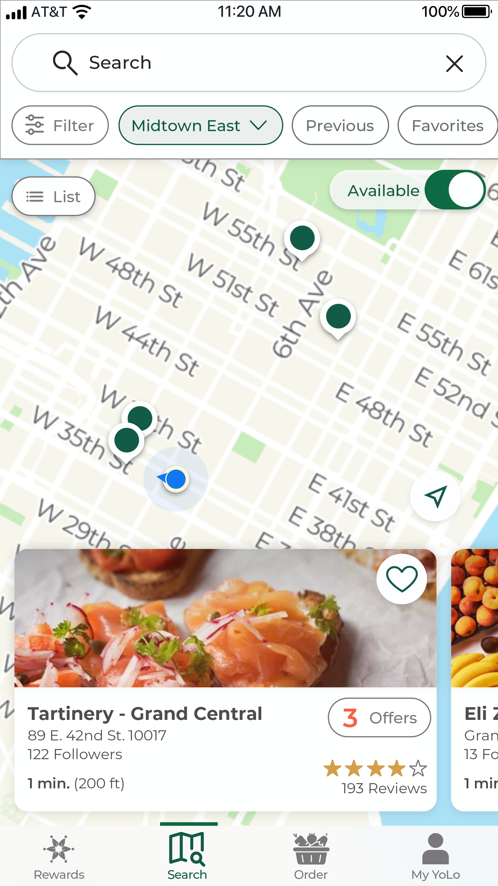
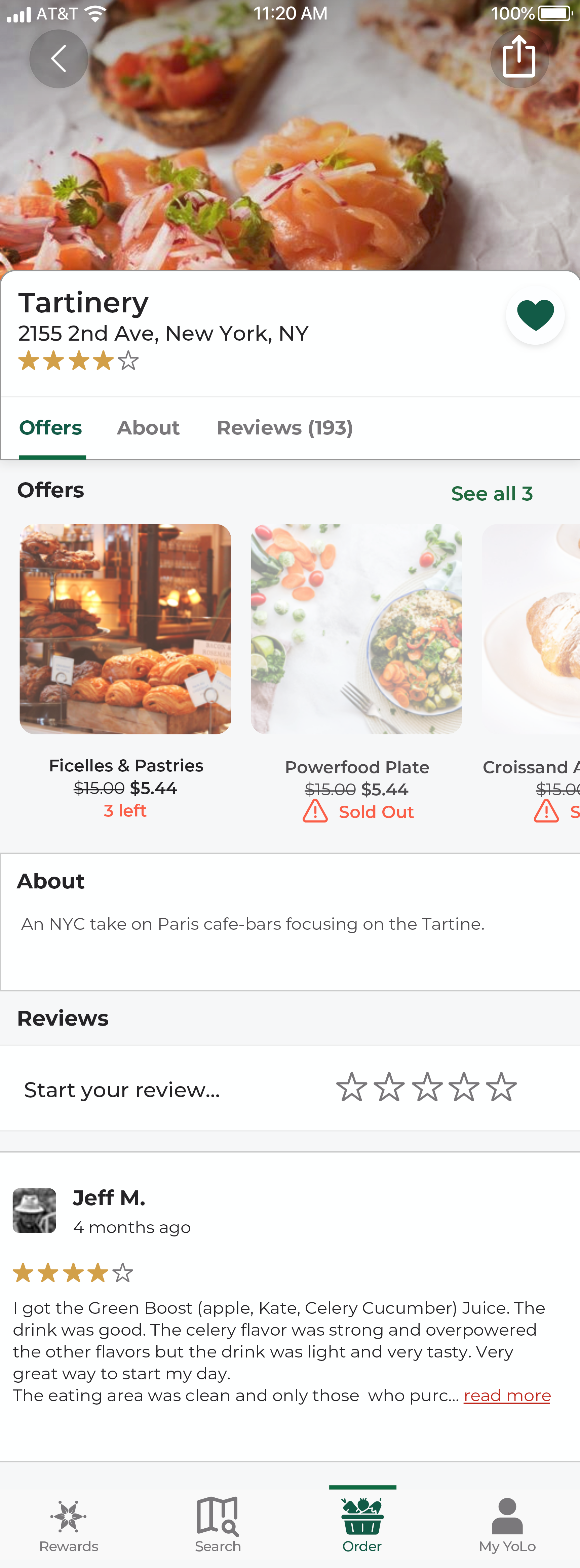
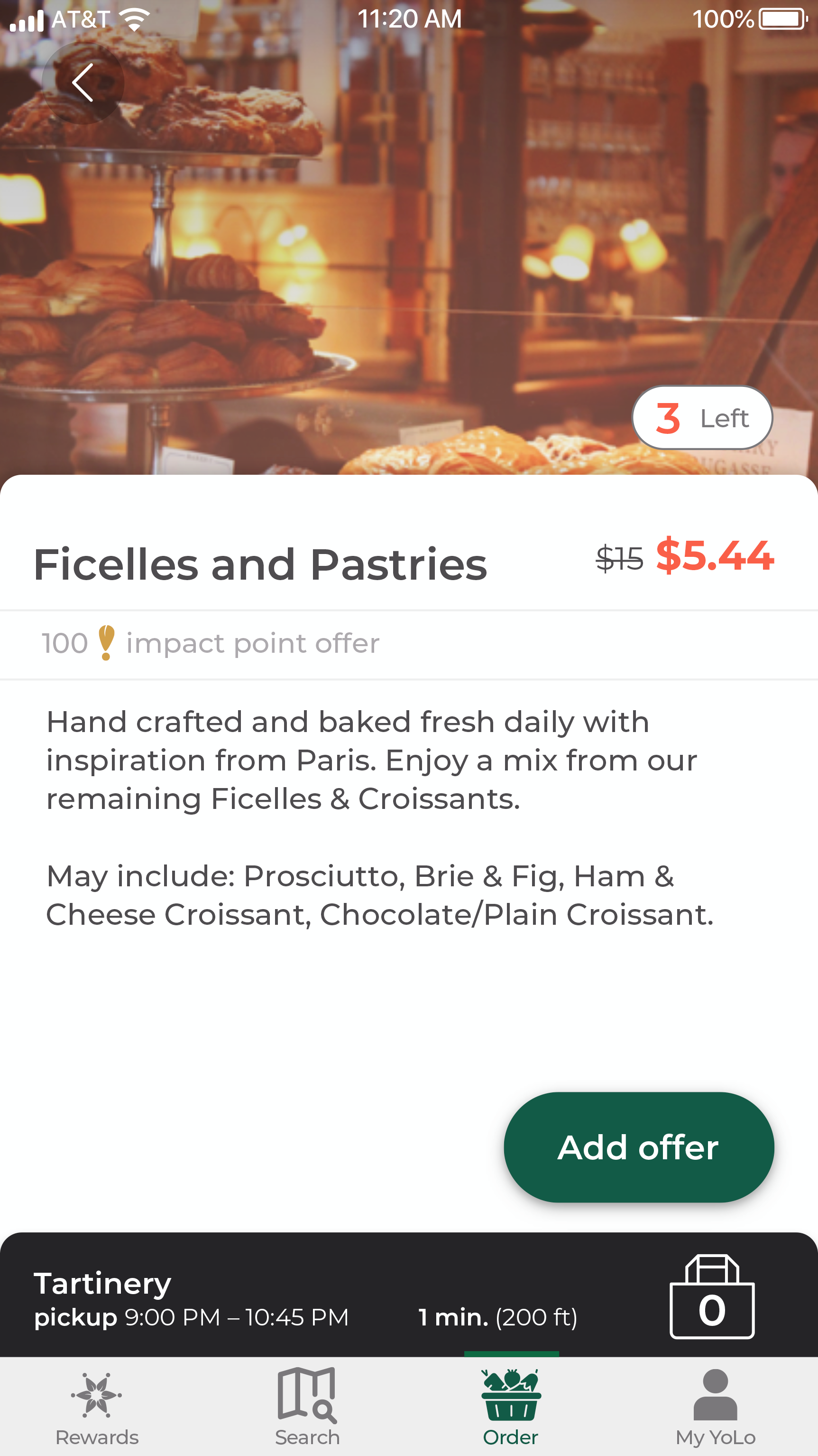
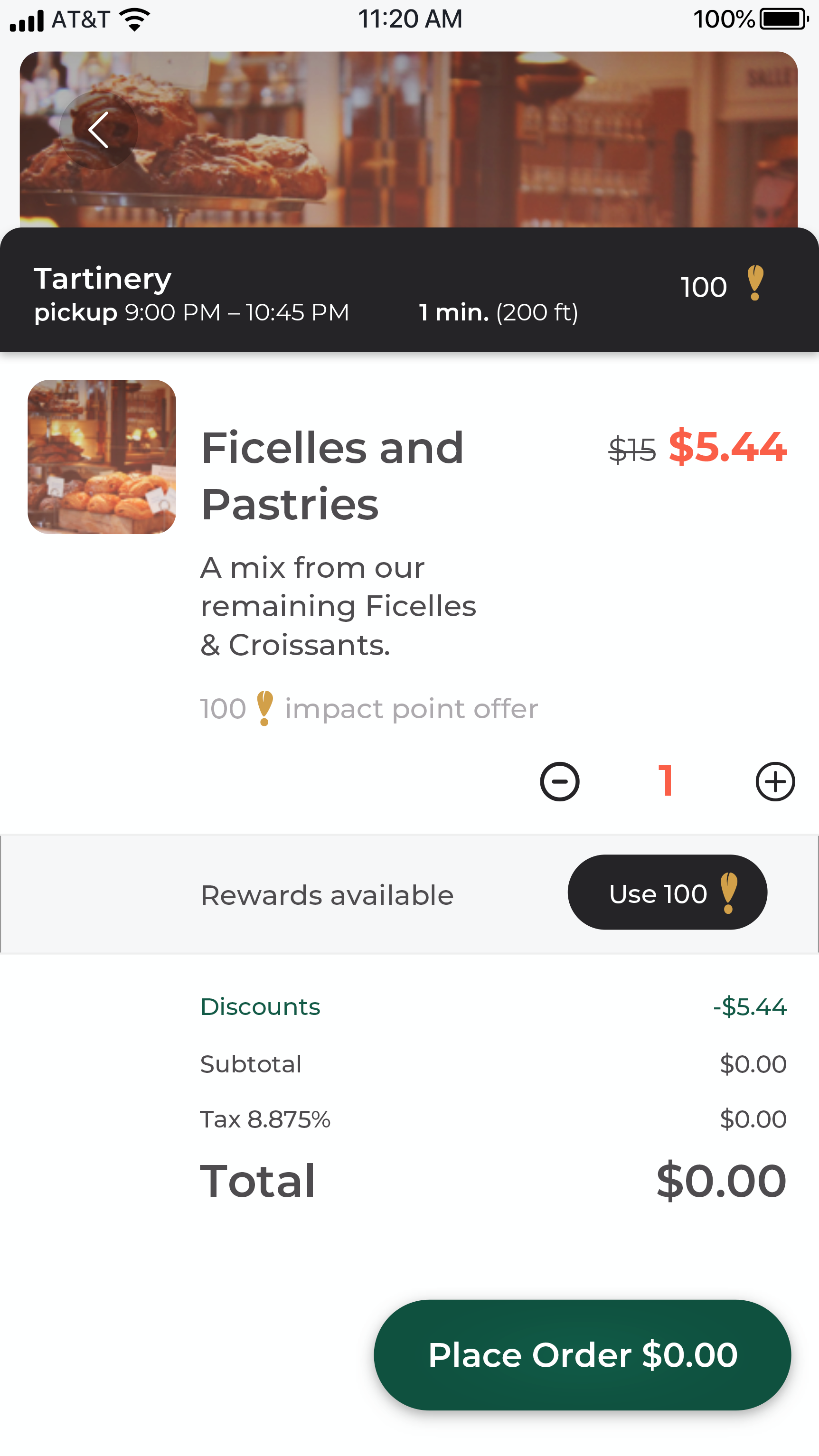
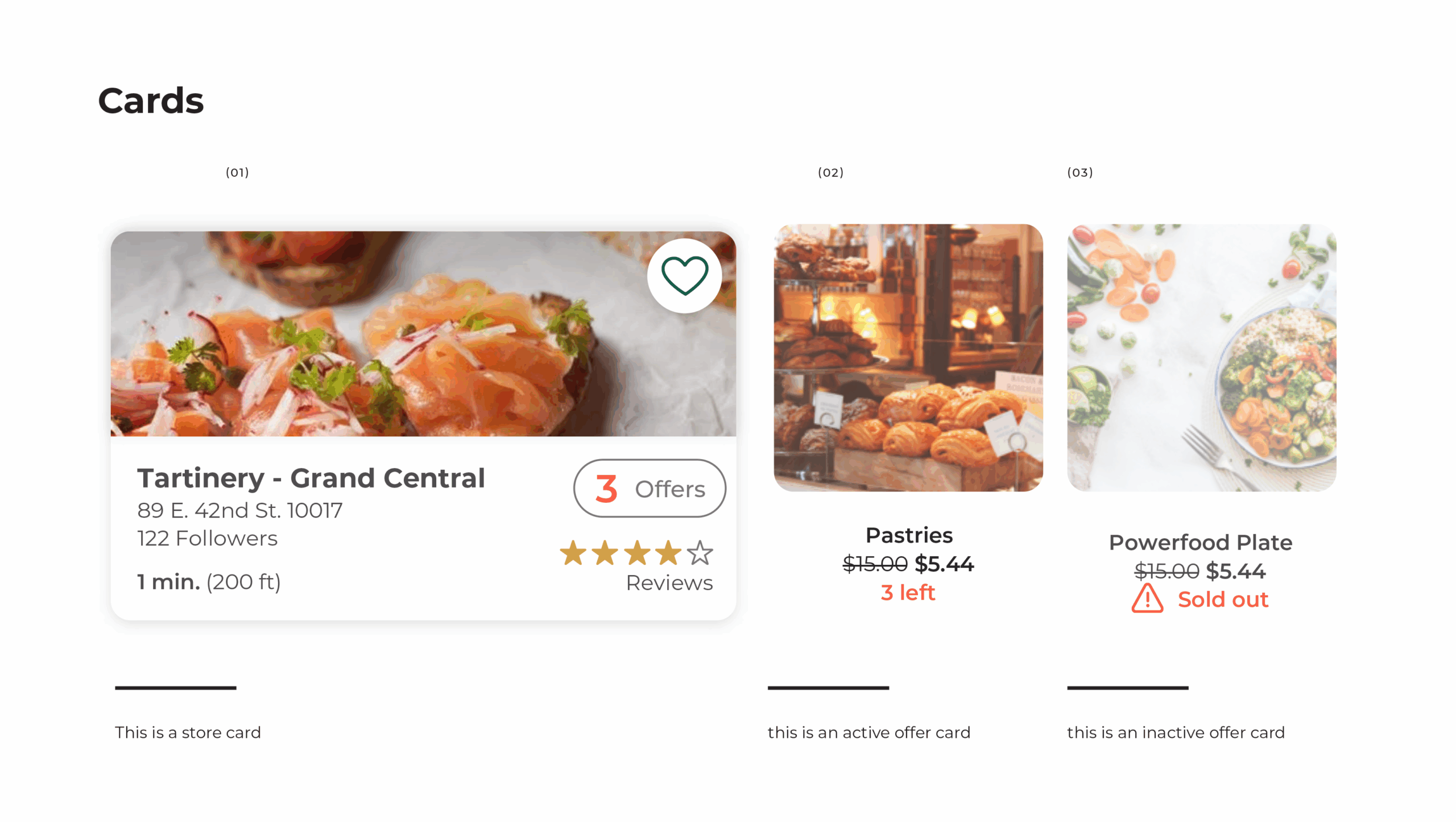
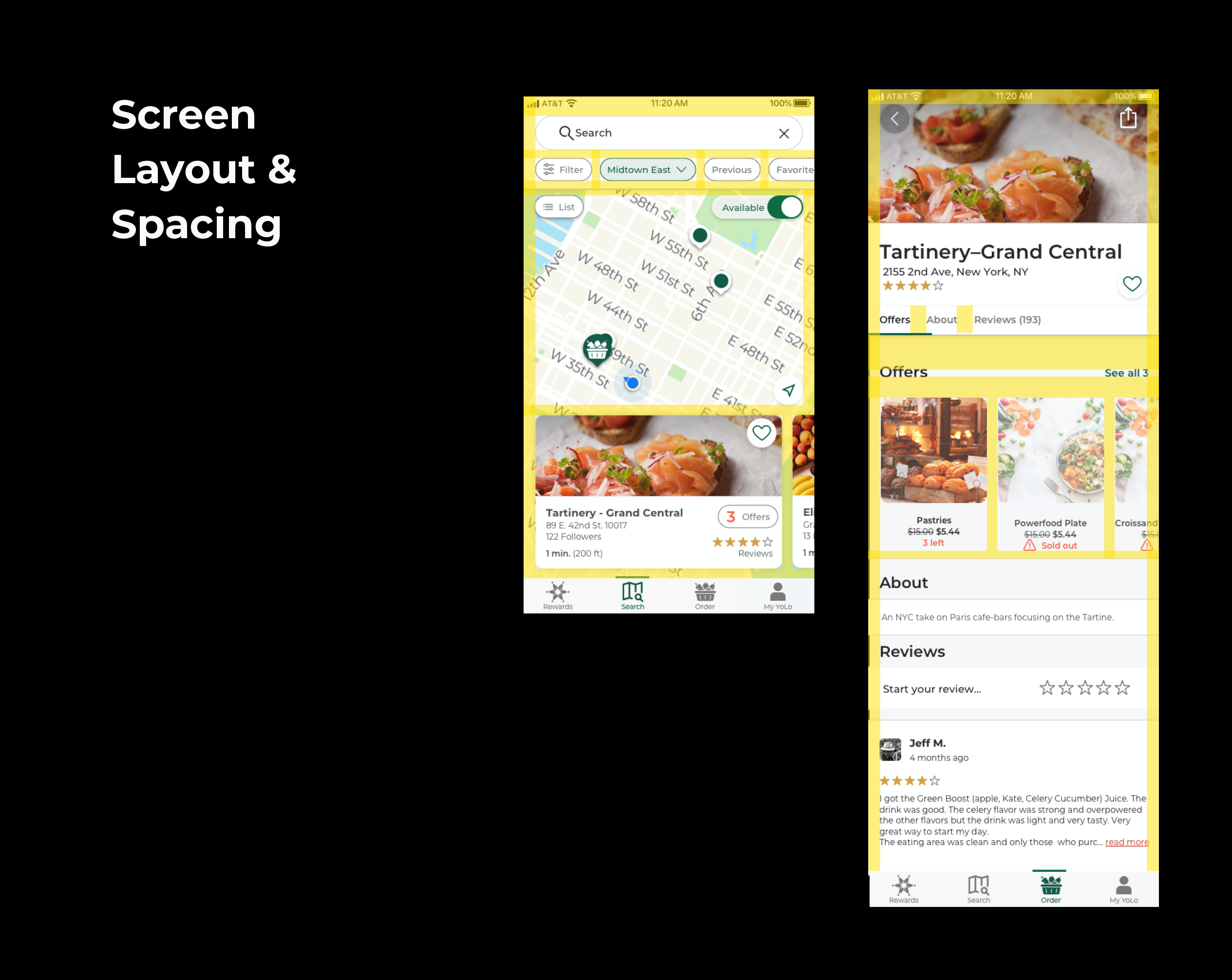
🧩 Prototype Task Flow
Participants were asked to simulate a pickup order using a click-through prototype.
Expected flow:
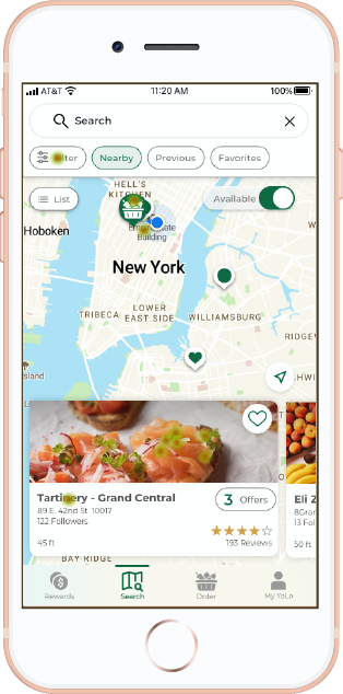
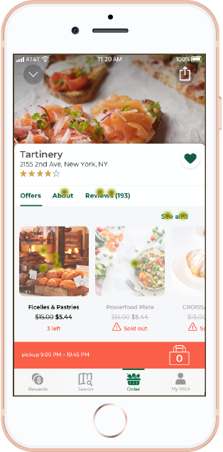
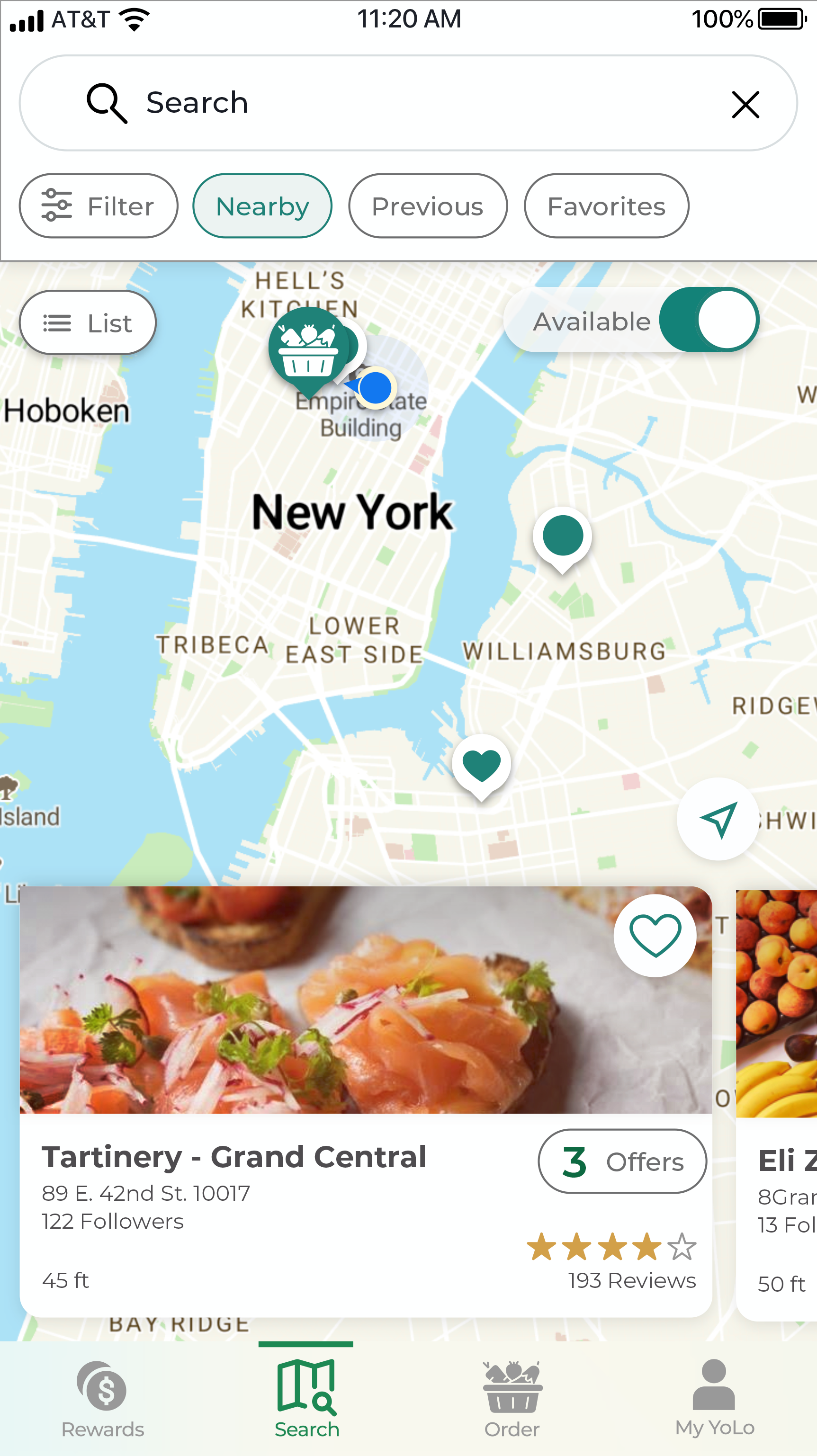
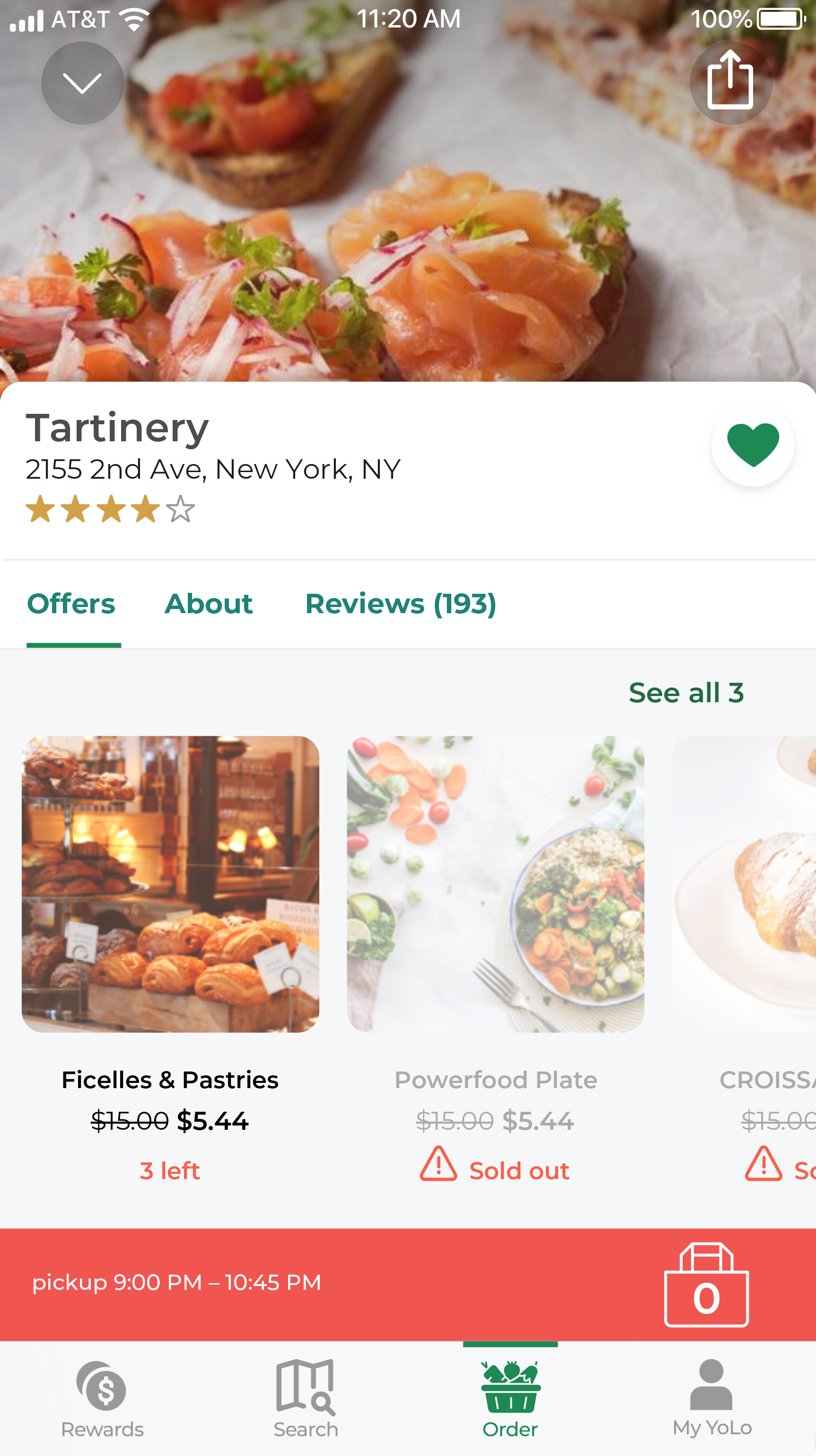
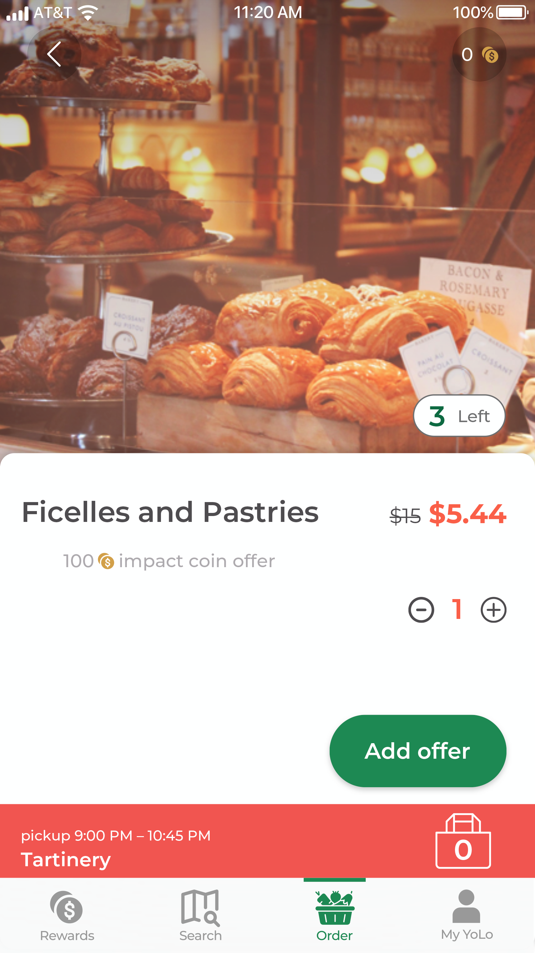
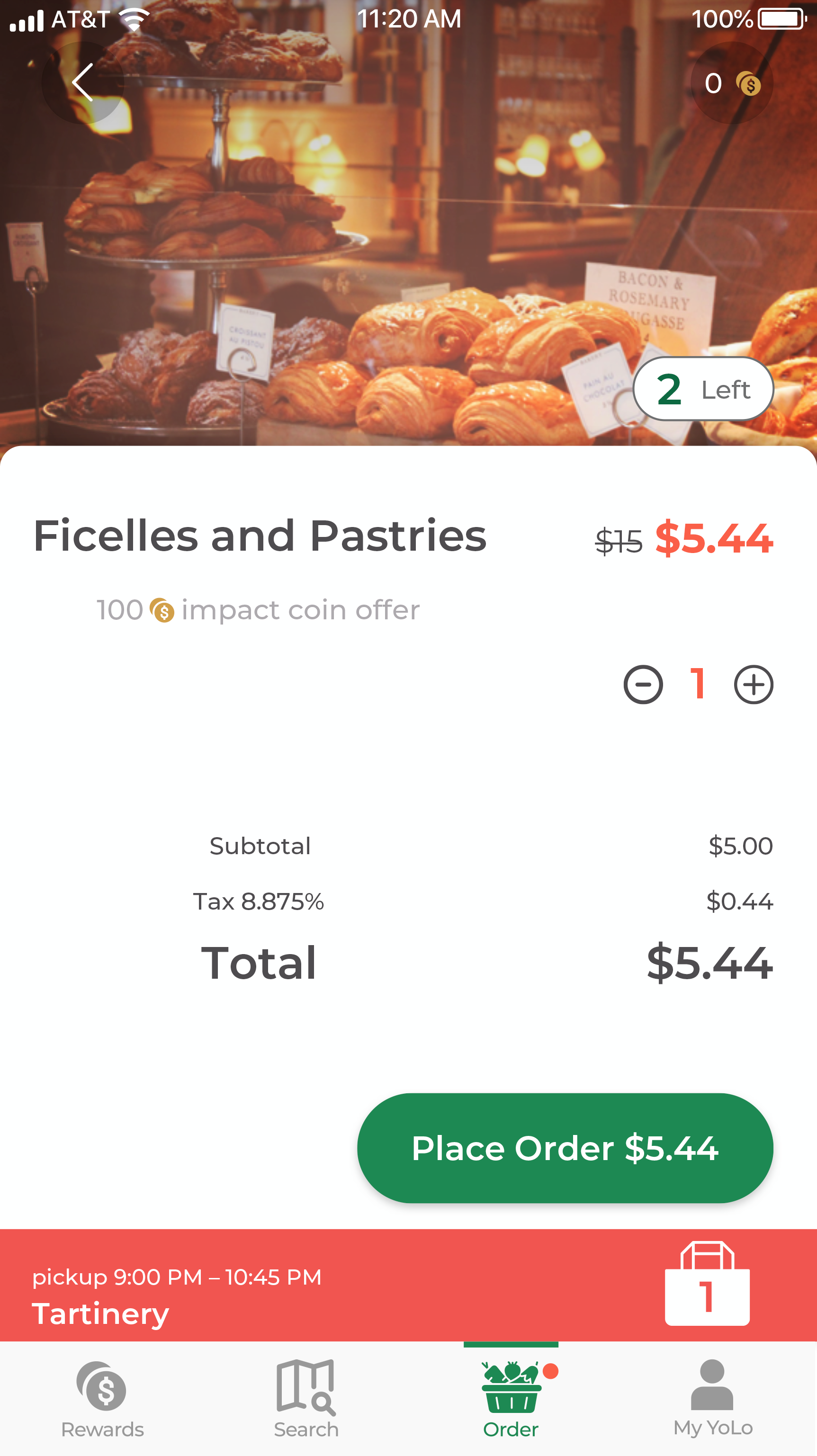
Step 1: Map Screen – choose store card → Step 2: Shop Offer screen – choose available offer→ Step 3: Add Order screen – add the offer to order the “bag” for checkout → Step 4: Place Order screen – once confirmed place order
Each screen included only the essential UI for testing clarity and behavior at each stage.
📊 Task Completion & Navigation
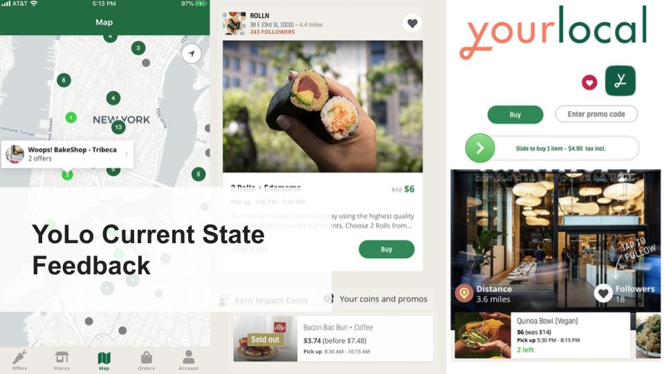
While many users demonstrated confidence in navigating the flow, only 20% of participants completed the task on the first click. However, this metric doesn’t fully reflect task comprehension, as several drop-offs occurred due to unbuilt interactions or curiosity-driven exploration.
Map vs. List navigation: 50% of users gravitated toward the map, while others preferred offer or store lists
Click behavior: Users often explored About, Reviews, or “See More Offers” sections before checking out
Impact Coin info: Multiple users looked for more explanation about YourLocal’s sustainability rewards
“I didn’t go straight to checkout because I wanted to see more from that store—it felt like I should be able to.”
— Usability Participant
🧠 Effort & Experience Scores
Participants rated the task as:
60% — Extremely Easy
30% — Fairly Easy
10% — Somewhat Difficult
These scores improved over the current state design, especially for clarity and layout.
🎨 Emotional & Visual Response
After completing the task, users selected adjectives to describe the experience. The top responses included:
70% — Clean
60% — Modern
50% — Easy
50% — Reliable
40% — Personal
Additional mentions: Joyful, Chic, Creative, Environmental, Too Complex, Outdated
🖼️ [Insert heatmap, quote blocks, or annotated UI screenshots]
Prototype
“It’s personalizable because you can do the search and have your favorites pop up and be filtered. It’s a more intimate experience.”

Clarify impact coins rewards system
More info needed
🧭 Key Takeaways
Flexibility is essential: Users have different mental models for ordering food—some browse based on mood, others on proximity. The app must support both.
Clarity of features: Users need clearer explanations of rewards (Impact Coins) and actionable visuals for proximity and availability.
Balance is key: Clean layouts performed better, but users still want warmth, personality, and meaningful microinteractions.
Next steps: Add onboarding guidance, test microinteractions for about/review toggles, and revisit CTA placement and visual hierarchy.
Provide users with easily accessible information about impact coins.
Let users know exactly where offers are in relation to their location.
Give users ways to easily and quickly browse through options that fit their personal needs.
amount
amount
changed
🎨 High-Fidelity V2 & Future Recommendations
Following usability testing of the first high-fidelity prototype, I refined key screens and interface components based on user feedback. These updates focused on accessibility, emotional tone, and personalization—areas users clearly valued.
🔄 Iteration Focus
In V2, I began implementing changes based on behavior insights from the second round of user testing:
Simplified visuals: Reduced visual clutter and increased contrast in high-focus areas like CTA buttons and cards
Clarity in flows: Refined the “Add to Order” screen and checkout sequence based on hesitation and missed taps
Personalization signals: Introduced clearer affordances for filters, saved items, and location context to support exploratory behavior
🖼️ [Insert side-by-side comparison or key updated screens here]
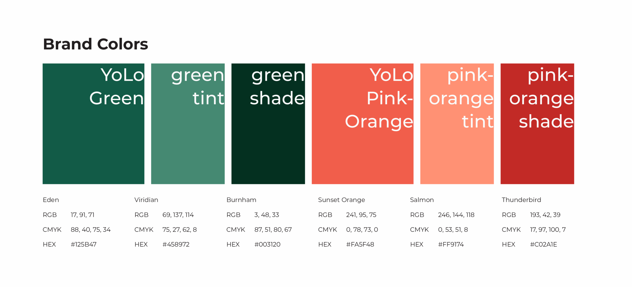
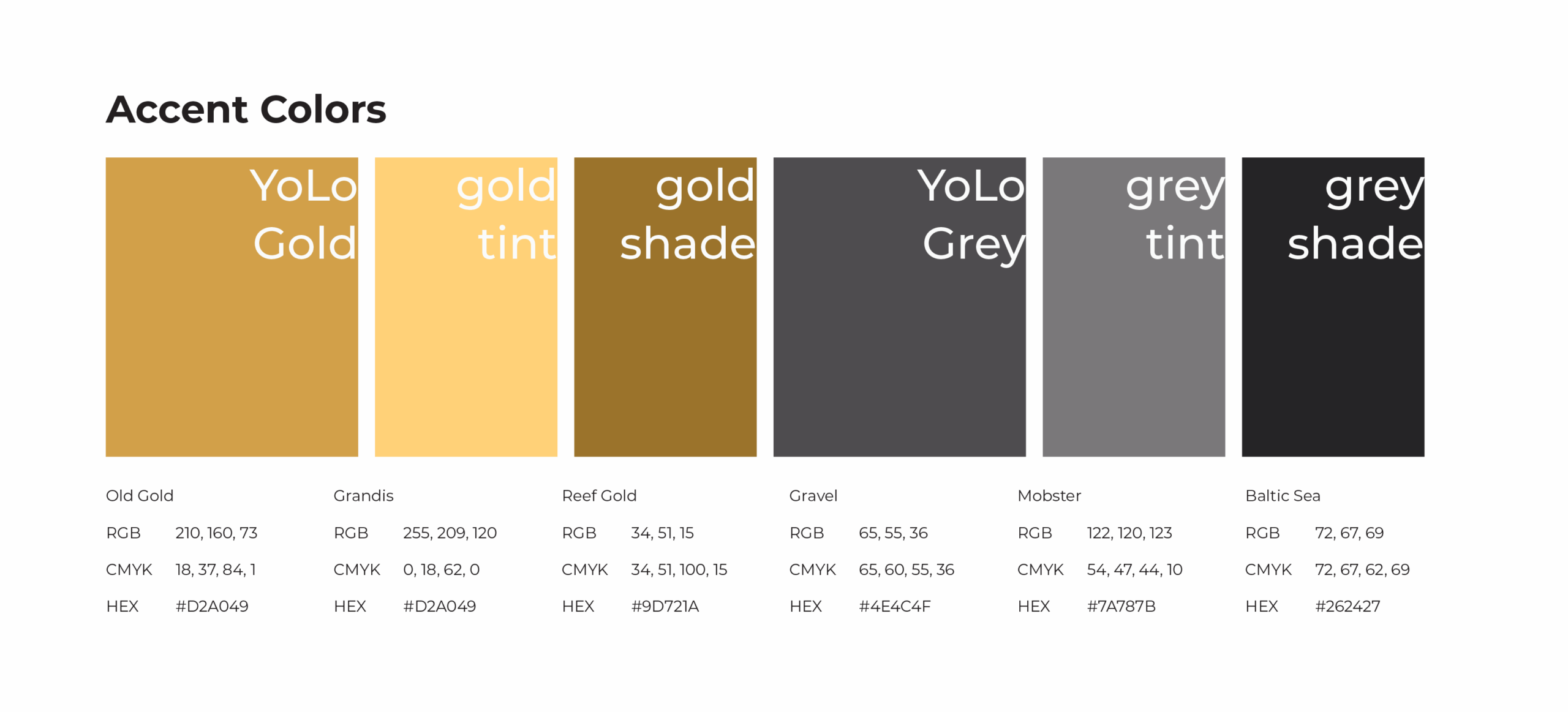
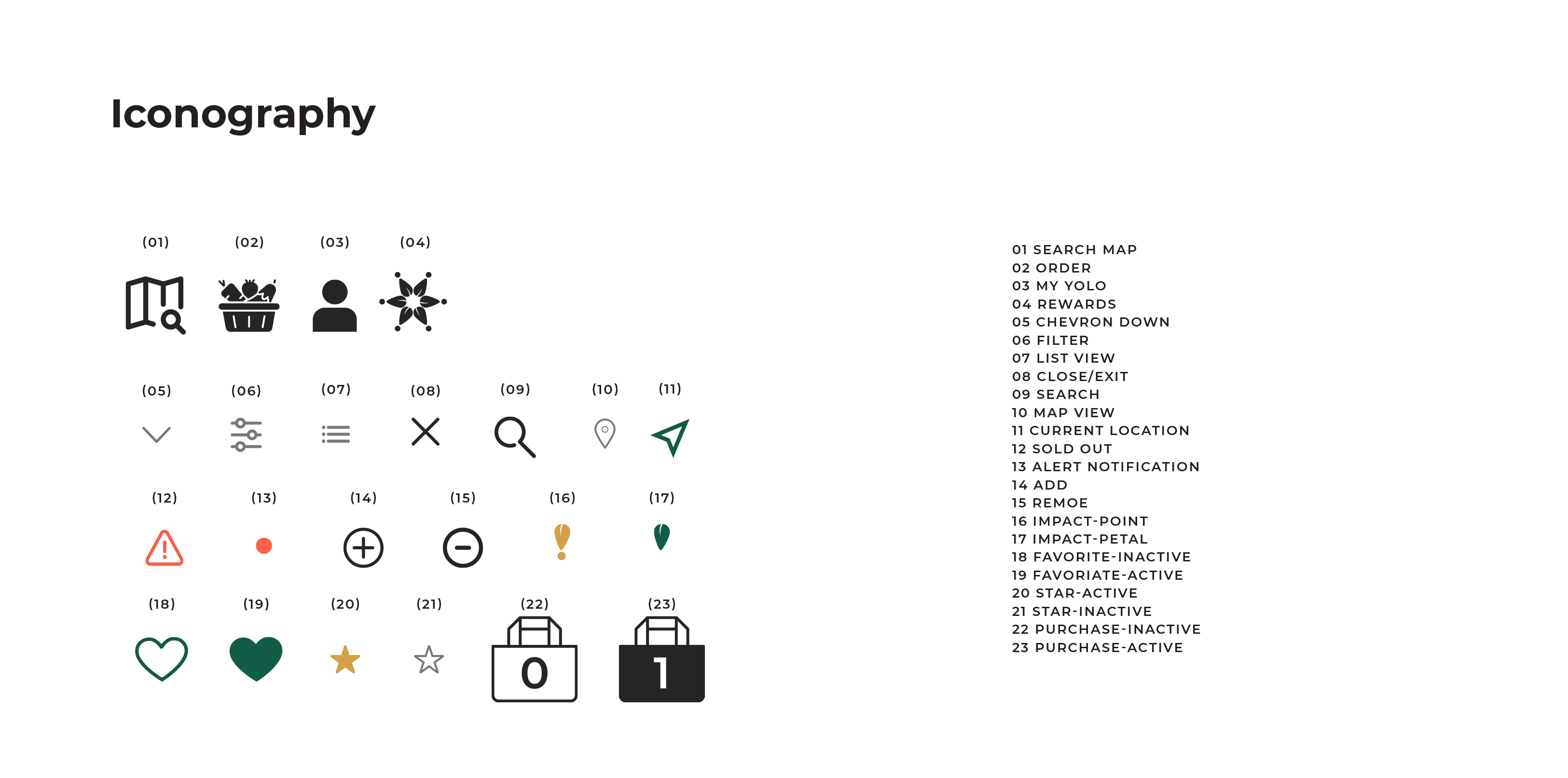
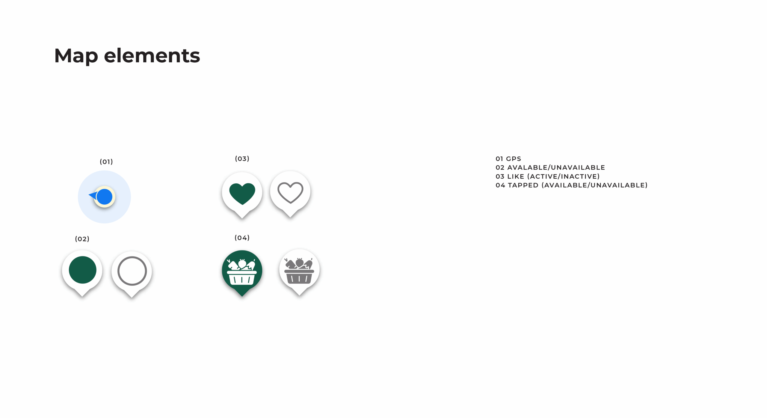
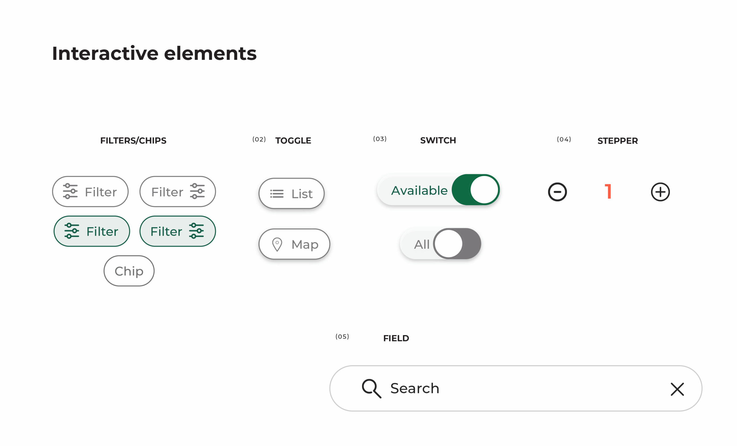
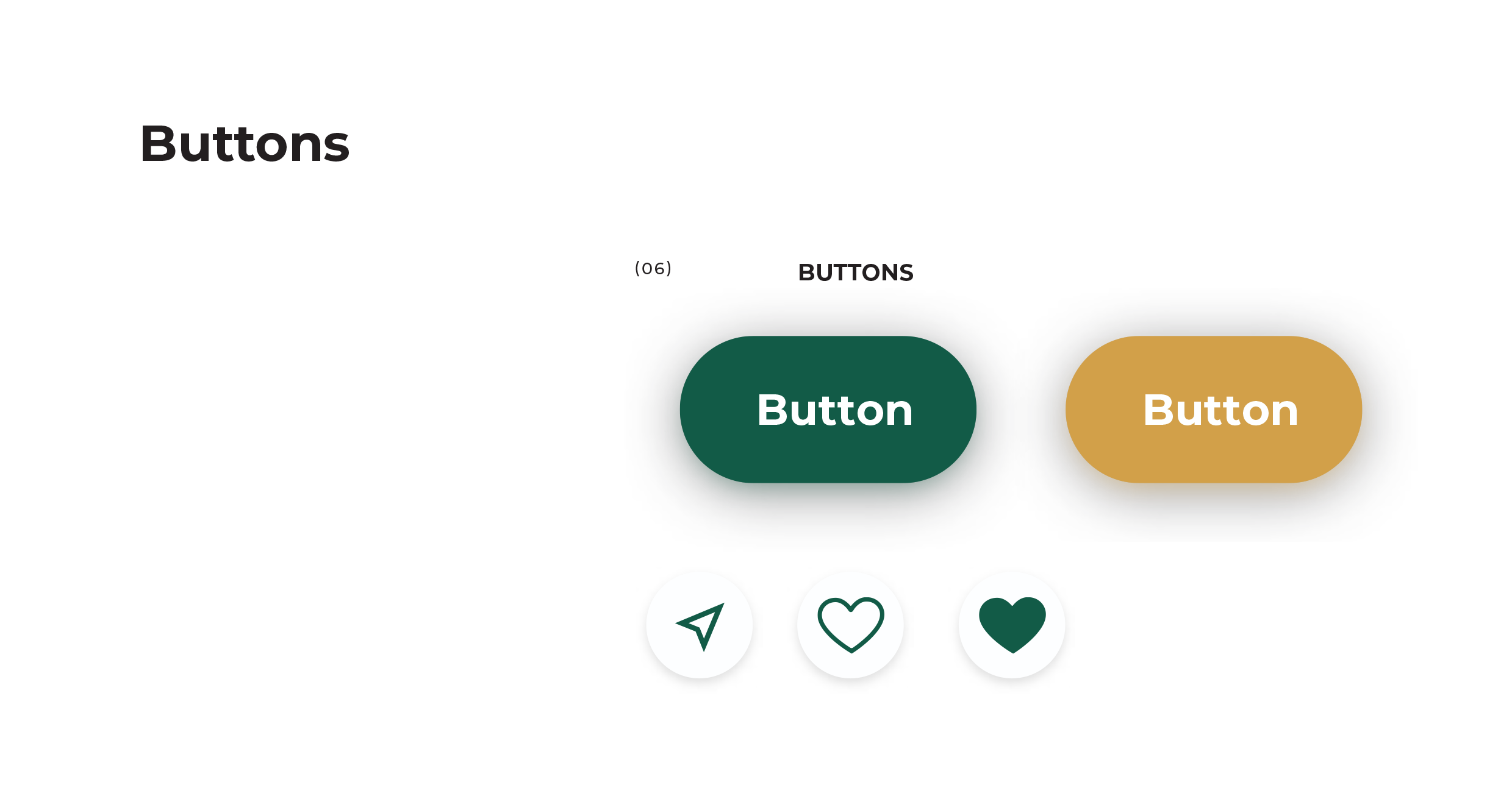
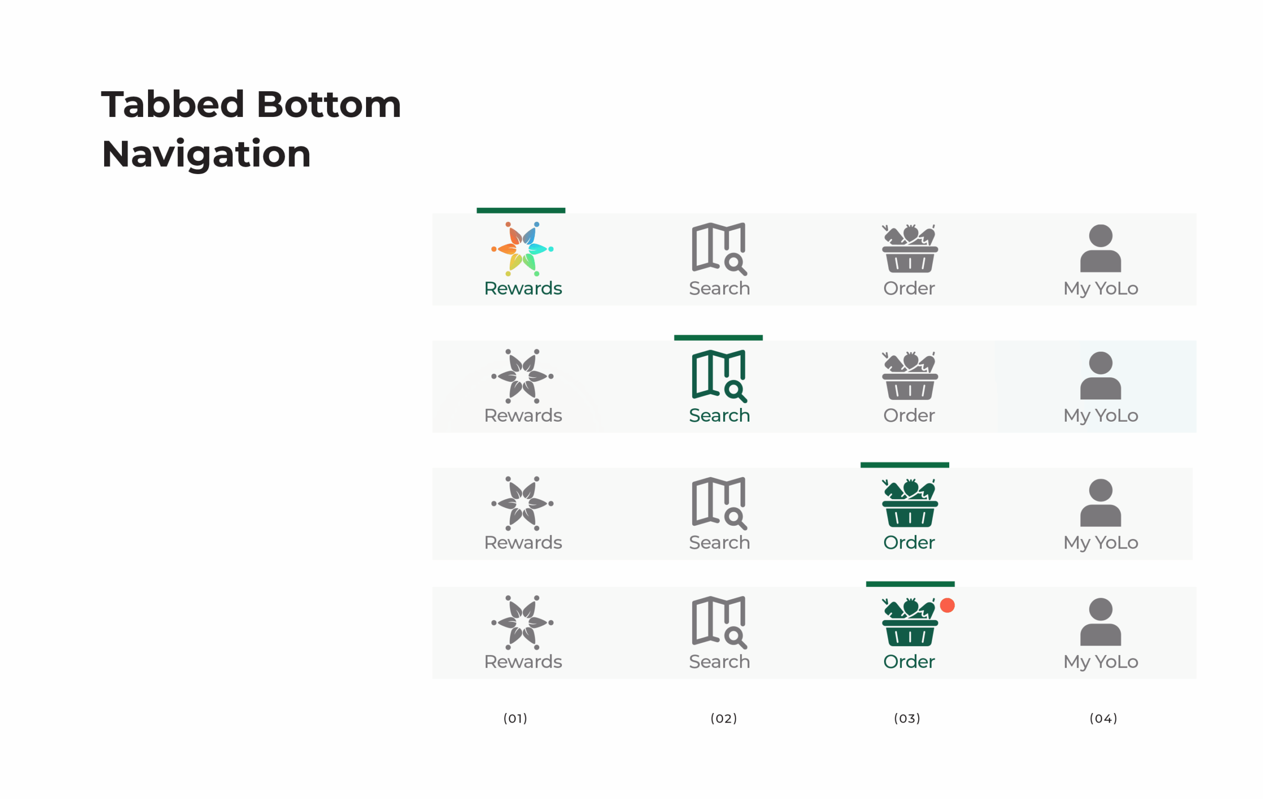
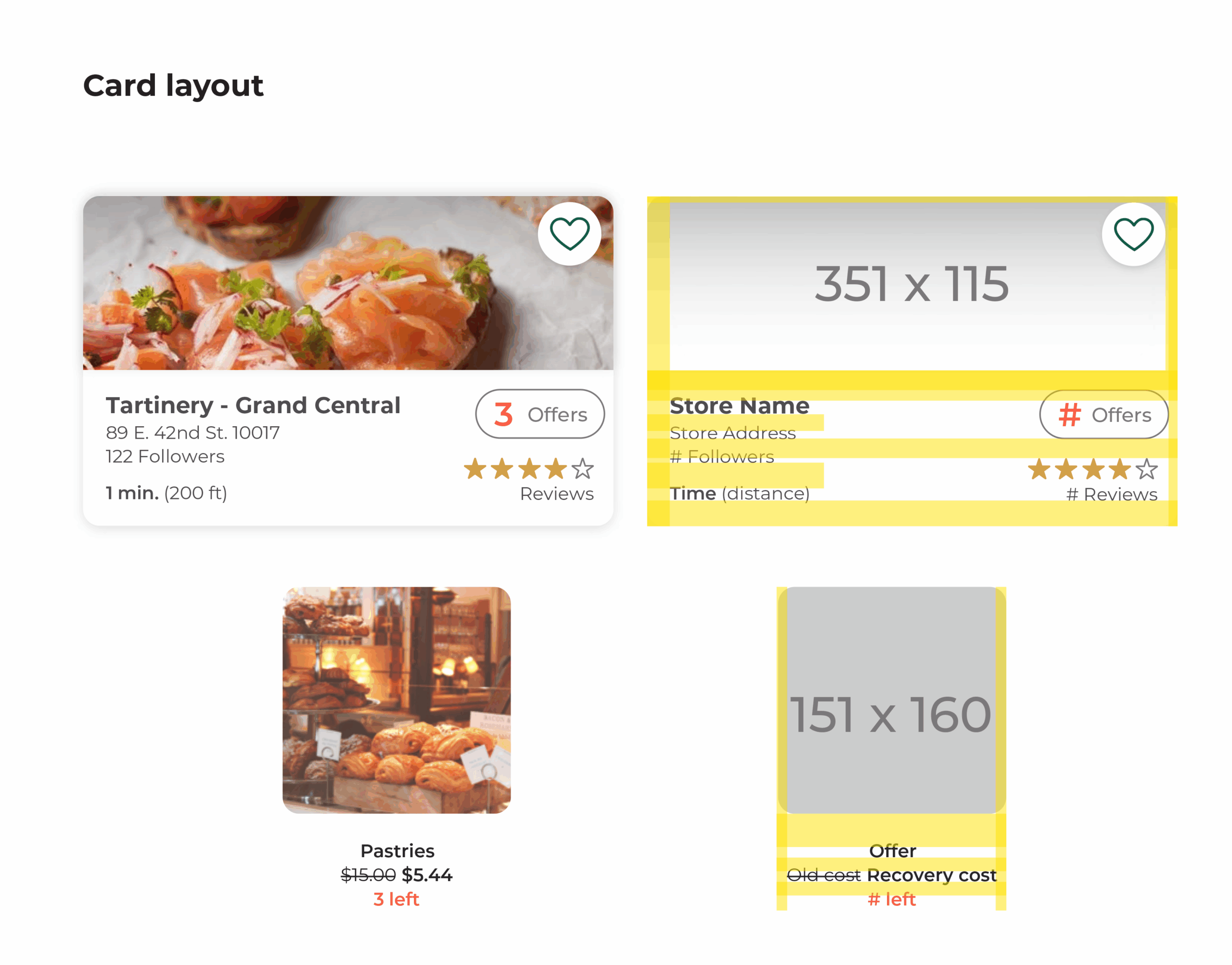
🧭 UI Kit & Style Guide
To maintain consistency and scalability, I created a mini UI kit and style guide covering:
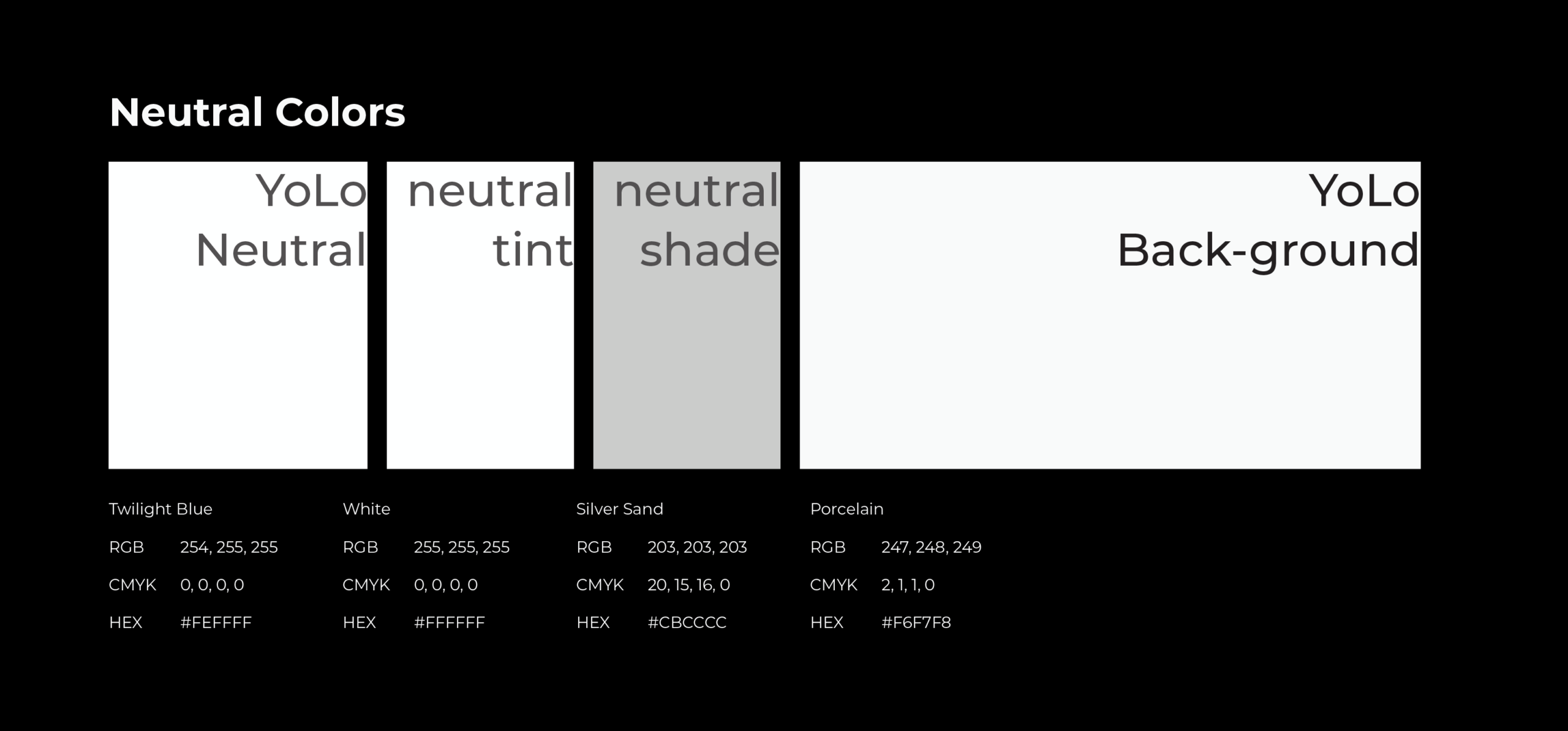
Color system: Balanced warmth with neutrality. Primary colors include soft peach, clean green, and warm beige.
Typography: Chose rounded sans-serif fonts for approachability and screen readability.
Buttons & Components: Developed consistent UI patterns for filters, cards, modals, and bottom sheets.
Iconography: Simplified icon set with testable affordances for vision accessibility.
🖼️ [Optional: Style tile or UI kit snippet here]
“Clean, friendly, and modern—but doesn’t feel like it’s trying too hard.” — User feedback
🔮 Future Recommendations
🧪 User Testing (Round 3)
Due to holiday timing, a third testing round wasn’t conducted. I recommend:
A Click Test-first methodology to better assess user curiosity and path logic, especially where filters and expandable UI haven’t yet been built
Atomic-level iterative testing, starting with one screen/component at a time (e.g., building out Map Filters, then Offer Cards, then Favorites flow)
👁️ Accessibility Enhancements
Test icon + label pairings to support color-blind or low-vision users (e.g., a heart + “Favorites” instead of relying on a filled state only)
Add larger tap targets and explore high-contrast modes for filter chips
💸 Rewards Redesign
Clarify Impact Coins using onboarding illustrations or a persistent tutorial
Study models like Starbucks Rewards for reference—gamify without overwhelming
📦 Order Flow Improvements
Design and test a tabbed order view (Pending / Favorites / Recents)
Add promo code input, estimated pickup time, and confirmation screen instructions
Explore curved parallax imagery + scroll-triggered headers for visual hierarchy and motion cues
💬 Additional Features
Build a Yelp-style Reviews tab per shop
Design Empty States for personalized screens (Recents, Favorites, etc.)
Add microanimations for interactive moments like adding an offer or updating quantities
🖼️ [Optional: annotated UI sketches or roadmap summary]
✍️ Next Steps
Begin screen-by-screen build-out using atomic design iterations
Pair each update with short preference or usability tests
Continue aligning design decisions with Motion Sparks Emotion and Effortless Use principles
Individual Recommendations
Illustration Exploration
Design Another Task Flow
🔄 Retrospective
This project stretched me—in ways I expected and in ways I didn’t. Designing for YourLocal meant balancing aesthetics and accessibility, research and reality, and learning how to adapt when things didn’t go to plan. Some parts I’m proud of. Some I wish had gone differently. But I left this phase with a clearer voice as a designer—and a sharper understanding of where my boundaries are.
✅ What Worked
User feedback was the backbone. Even when testing methods weren’t perfect, hearing directly from users helped guide design decisions and spot emotional blind spots.
The UI kit brought things together. We built it at the end, but it helped everything finally click—visually, structurally, and emotionally.
Click tests over task flows. People don’t always navigate in straight lines. Letting users explore gave better insight into what they actually wanted to see or do.
❌ What Didn’t
Team responsibilities got messy. I ended up taking on more admin and coordination work than I should have. I didn’t push back early enough, and by the time I realized I was behind on my own work, I was already overwhelmed.
I burned out. I asked for help when I was slipping, but the program had a tight timeline, and the answer was basically: keep going. I tried. I got it done—but not everything I wanted made it in.
Moodboards weren’t ideal for testing. They gave us something to work with, but they weren’t meant for that kind of feedback. And it showed.
🧠 What I Learned
Clarity matters. In visuals, in flow, and in communication—especially with your team.
Done is better than perfect, but aligned is best. Testing something real—even if it’s simple—works better than explaining five things that almost exist.
Users want room to wander. They won’t always follow your flowchart. And that’s not a flaw—it’s feedback.
🛠️ If I Had More Time
Honestly? I would’ve spoken up sooner. When the group contract fell apart and people stopped checking in, I took on too much because it felt easier than confronting it. I didn’t want to be “that person.” But trying to keep the wheels turning meant I had very little energy left for my own screens.
When I finally asked for support, there wasn’t much anyone could do. It was a fast-moving program. The deadline didn’t budge. So we tested my moodboards instead of full style tiles. It wasn’t what I wanted, but it was something. And it still gave us insight.
After a break, I made a hybrid board—part moodboard, part style tile—not for testing, just for me. I needed to know if the fog had lifted. And when I finished it, I realized I wasn’t struggling to translate my ideas anymore. That was the real turning point.
Next time, I’ll simplify sooner. Ask for help earlier. Let go of trying to hold everything together, and focus more on doing the kind of work I believe in—with enough space left to actually enjoy it.
“This phase taught me as much about boundaries and burnout as it did about branding. That’s a lesson I didn’t expect—but probably needed most.”

